
- Client
- Alula Technologies
alulatechnologies.com ↗ - Sector
- Digital health · insurance & employee wellness
- Origin's role
- Product discovery, requirements definition, UX & UI design, rebrand
- Requirements workshop
- Expert product review
- UX & UI design
- Prototyping
- Internal usability testing
- UI & flow testing
- Navigation framework redesign
- Health status visual design
- Onboarding design
- Design system
- Content & UX writing
The challenge
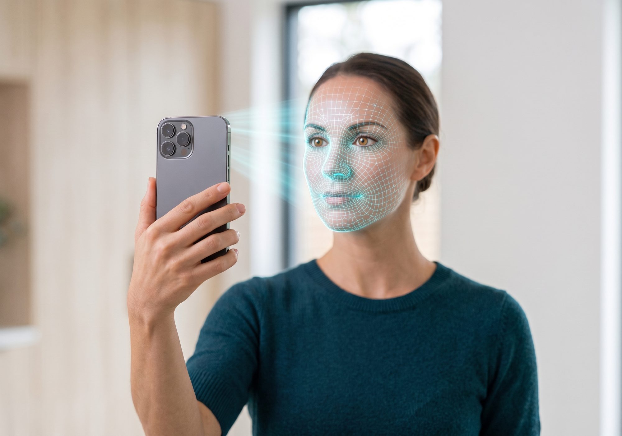
Alula Technologies built VivaScore as a personal digital health companion. A user takes a Digital Health Check, a short facial scan on their phone, links a wearable or a fitness app, and VivaScore combines all of it into a score from 1 to 100 that updates as new data arrives. It is sold through employers, insurers and healthcare providers, who make it available to their people. The scoring algorithm had been validated with insurers and reinsurers, so the measurement was sound.
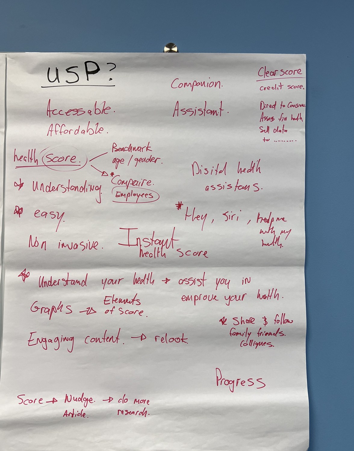
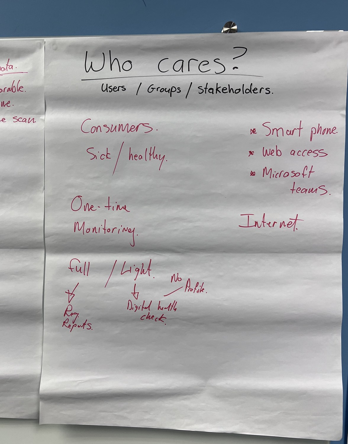
Alula asked Origin to run a requirements workshop and an expert review of the existing app, then redesign it. The stated goal was a modernised, rebranded app. The real test was engagement. VivaScore only works if people come back, read their score and act on it, and the existing app presented that score as one tile among dozens of near-identical gauges. A user had no way to tell whether they were doing well, what was pulling the number down, or what to do next. A product sold on making health easy and meaningful was asking people to interpret a dashboard.
Our approach & thinking
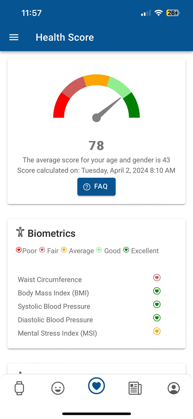
The existing app showed everything the algorithm could measure, all at once: blood pressure, cardiac workload, stroke risk, VO2 max, body shape index, breathing rate, each rendered as its own dial, none ranked. The interface treated the user as an analyst who wanted the full data set, when the product's promise was to spare them that. For a behaviour-change app, that is the whole problem. If someone cannot see in a few seconds where they stand and what to do about it, the app has failed at the one thing it exists to do.
The redesign started once we agreed that the score, and the next action, come first. The VivaScore is the headline; everything else on the screen explains that number or tells the user what to do about it, ordered by how much it matters.
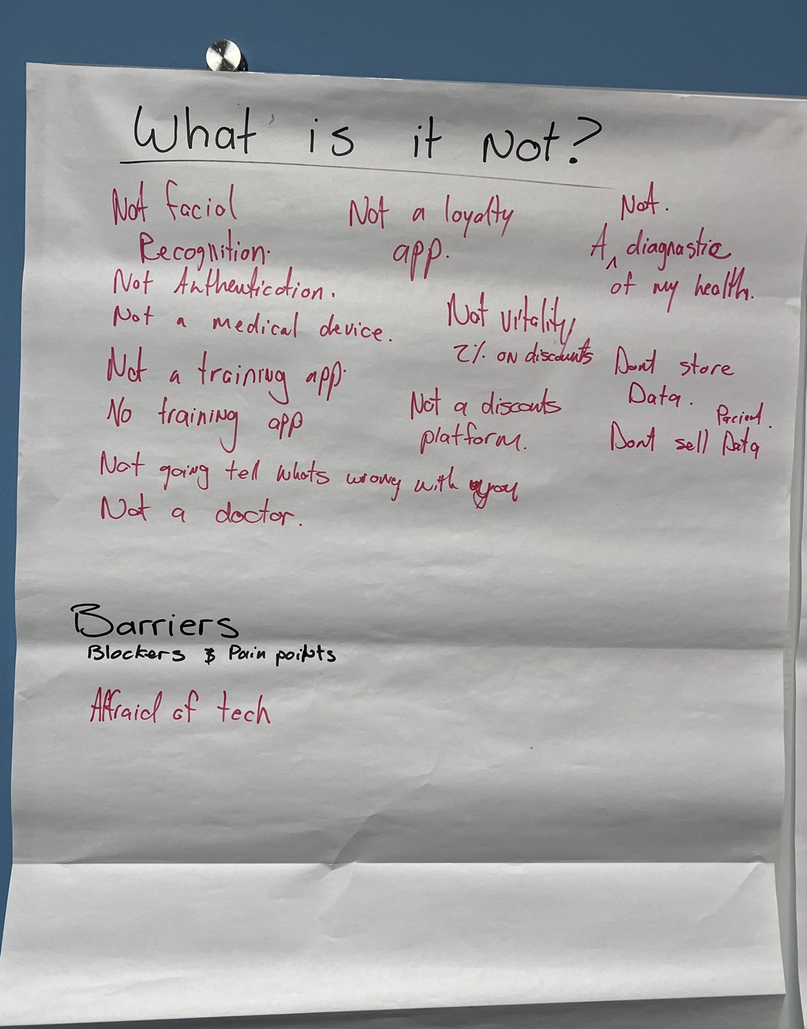
Agree what the product is, and what it is not: a personal health companion that informs and motivates, and explicitly not a medical device, a diagnosis or a fitness trainer. That boundary decided what each screen could claim.
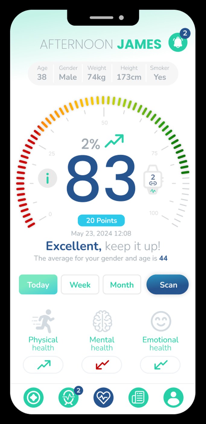
Lead every screen with the score and a verdict: the dashboard opens on the VivaScore, a plain-language line such as “Excellent, keep it up”, the trend, and the benchmark for the user's age and gender.
Group and rate the metrics instead of listing them: health-check results are sorted and labelled from Poor to Excellent, so the things that need attention rise to the top.
Design onboarding that gives before it asks: the opening screens explain what the user gets before the app requests a single permission or detail.
Build one visual system and rewrite the copy: a consistent identity and component set across the app, and interface wording gone through line by line to simplify sign-in, remove consent friction and put security steps in plain language.
Re-engineer the navigation framework: the mobile app's navigation was redesigned from the ground up around how someone actually moves through their own health picture, from the score to what is driving it to what to do next, rather than a flat menu of features. A new set of visual elements, shared graphs and status markers for physical, mental, emotional and financial health, replaced the old bank of dials, so a status reads as good, fair or needing attention at a glance and the user is guided straight to the part of their health that needs it.
Prototype and test before building: interactive prototypes let the team walk every core flow, from onboarding to the dashboard to a Digital Health Check, before production work started. Internal usability testing, backed by dedicated UI and flow testing, caught where a sequence of screens looked right but did not hold up when someone actually tried to complete it, so fixes landed before the app was built rather than after.
What we shipped
A redesigned VivaScore app, built on a re-engineered navigation framework so getting from the score to the detail behind it and back takes the same shape everywhere in the app. Onboarding introduces the product one benefit at a time and defers every request until the value is clear. The dashboard is built in layers: the score and its verdict first, then the health check grouped by rating, then device data, an emotional check-in, health history over time, articles chosen from what the score shows, goals with progress, and routes to professional help. A shared set of graphs and status markers carries the four health pillars, physical, mental, emotional and financial, through all of it, so the goal on every screen is the same: show the score, point at what needs attention, and give the user what they need to do something about it.
Alongside the screens, Alula's team got a visual system to build the rest of the app on, a set of prioritised enhancements, and a requirements document recording what the product is for and who it serves. The redesign makes the app do the interpreting: the old version handed the user the raw output of the algorithm, and the new one hands them a position and a next step, with the detail one tap away for the people who want it.
Outcome & value
The redesign became the basis of the live app, and the visual system carried into the screens built after the original engagement. The requirements document and the enhancement list shaped the phases that followed, and Origin stayed involved across those releases. The redesign closed the gap between what VivaScore is sold as and what it felt like to use: the pitch to an employer or insurer, that VivaScore makes personal health easy to understand and act on, is now something the app shows in the first screen.
The people who use VivaScore mostly come to it through an employer or an insurer, and many do not have easy access to regular health advice. For them, the app went from a readout they could not interpret to something that tells them where they stand and where to go next. Had it stayed a grid of dials, the score would have kept being accurate and kept going unread, engagement would have stayed low, and the buyers who renew on how much their people use the product would have had the numbers that justify dropping it.
In summary

Next steps
Is your app showing data instead of meaning?
Let's talk about it.
Tell us what you're working on, what you're trying to achieve, what isn't working, or where you think there's an opportunity.