
- Client
- Life Healthcare
www.lifehealthcare.co.za - Sector
- Healthcare · hospital ward management
- Origin's role
- Contextual research, UX & UI design, interaction design for a shared multi-touch display
- Contextual inquiry
- Stakeholder interviews
- Ward workflow mapping
- Wireframing
- Multi-touch interaction design
- UI design
- Access & permissions design
- Prototyping
The challenge
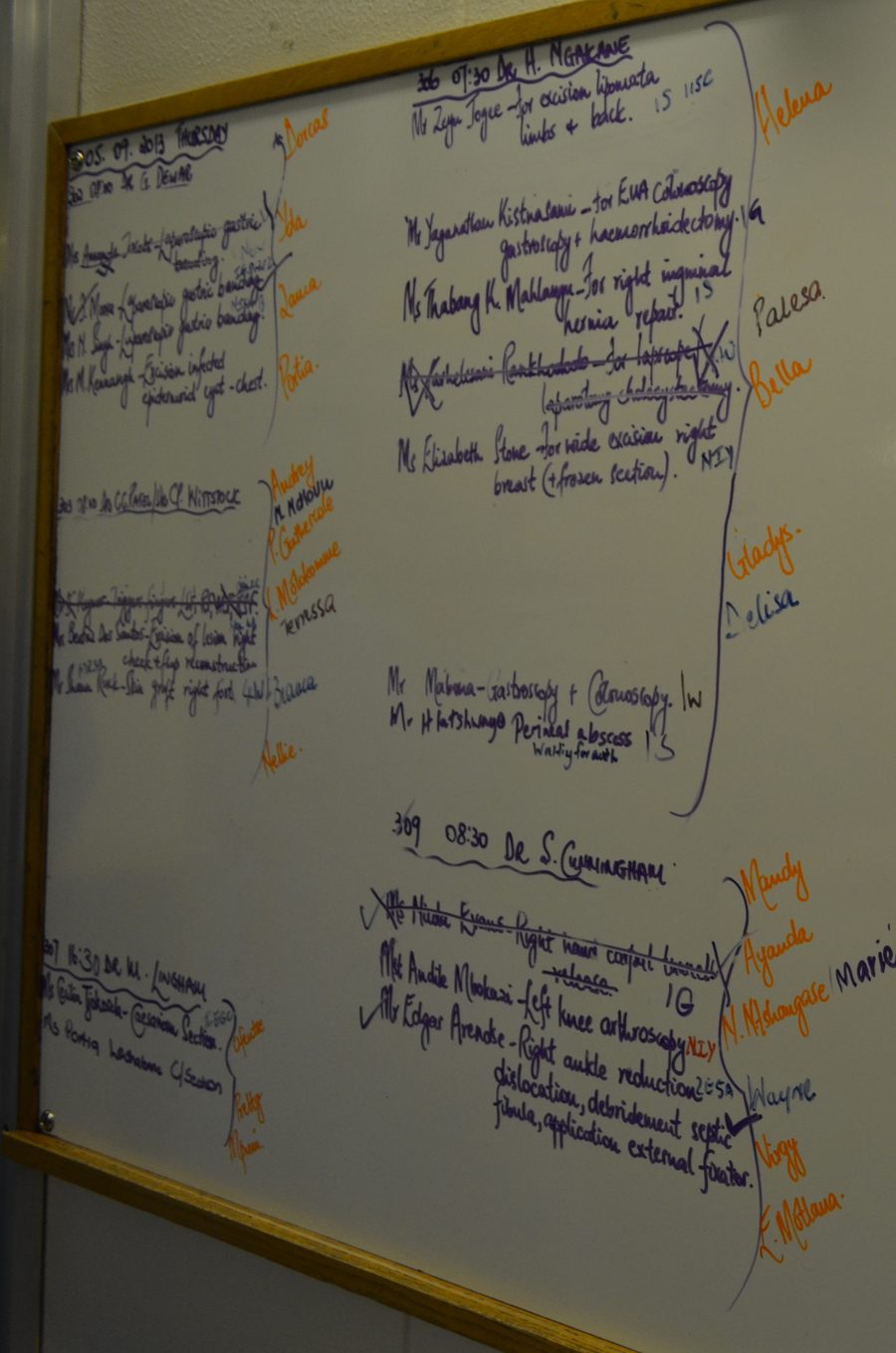
A Life Healthcare ward runs on the same basic instrument regardless of hospital: a whiteboard at the nurses' station, marked up in pen, listing every patient by room and bed, who is attending them, and anything the next shift needs to know. On a busy general ward that board is rewritten dozens of times a day, patients admitted, moved to another ward, sent to theatre, discharged, and the beds they leave behind blocked for cleaning or freed for the next admission.
Life Healthcare asked Origin to design a digital ward census screen, a shared multi-touch display mounted at the nurses' station, that could do everything the whiteboard did and do it live. The stated brief was straightforward: put the board on a screen. The harder requirement, less explicit but non-negotiable, was that it had to work the way the whiteboard worked. Nobody logs in to write on a whiteboard, several people update it in the course of a shift, and anyone walking past can read it without asking permission.
Our approach & thinking
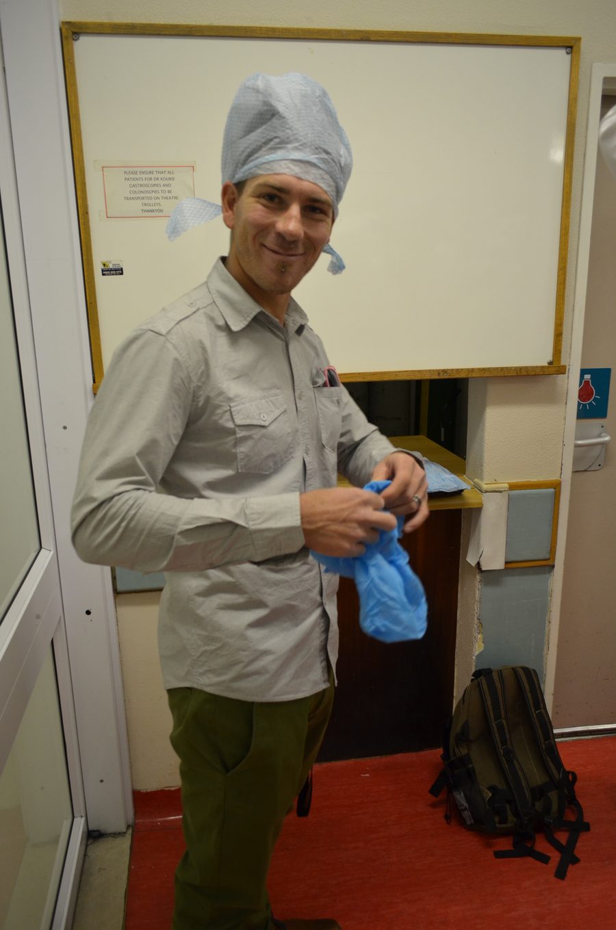
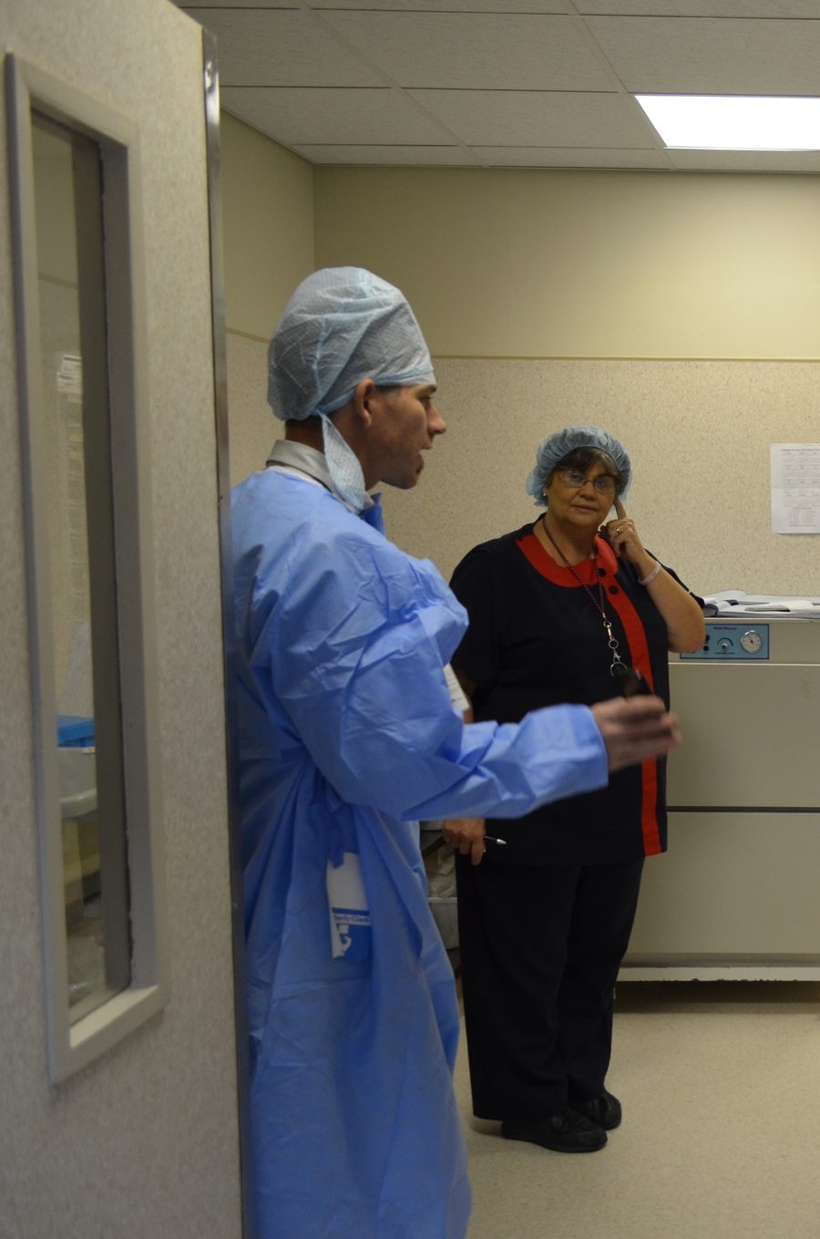
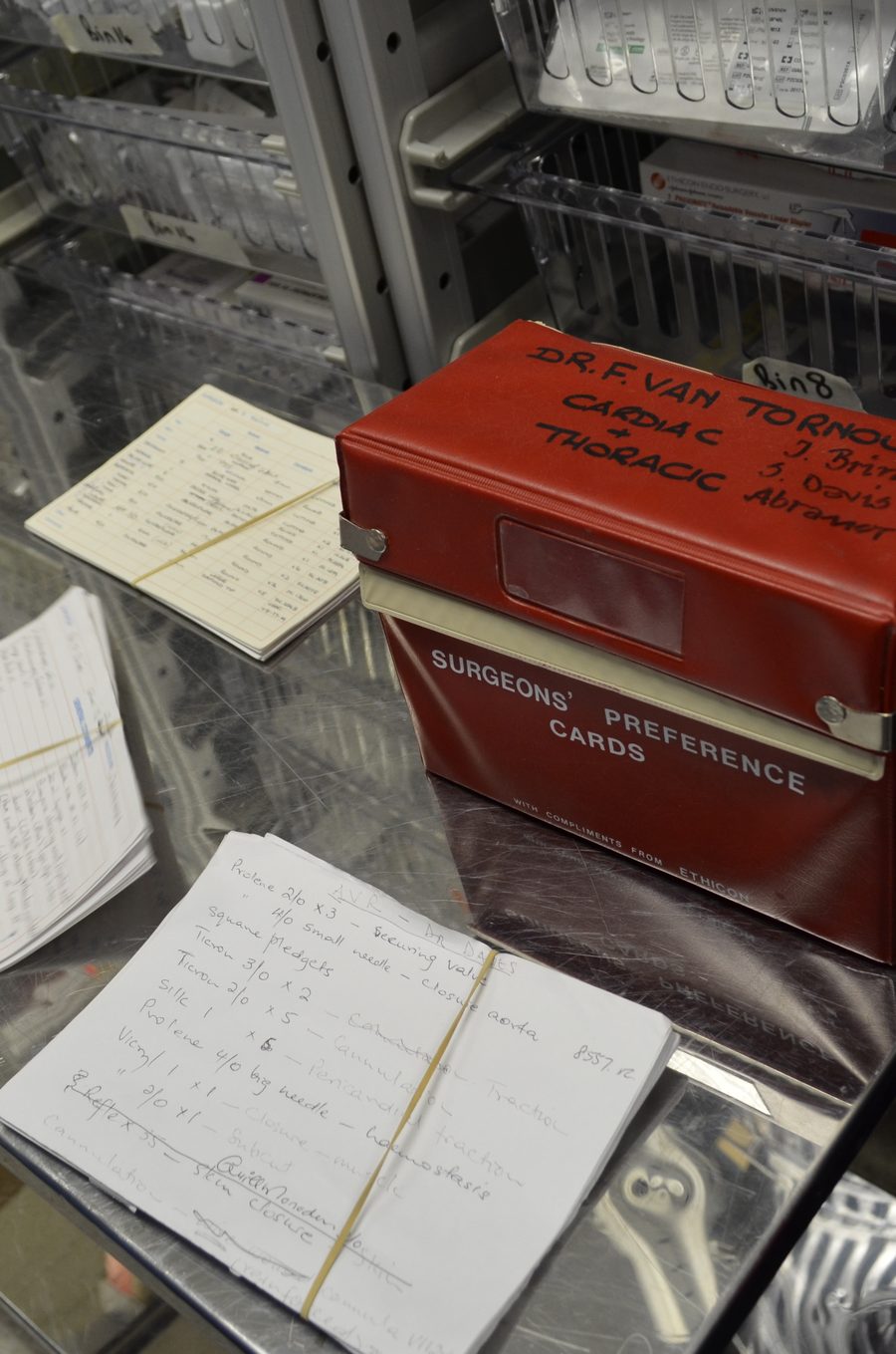
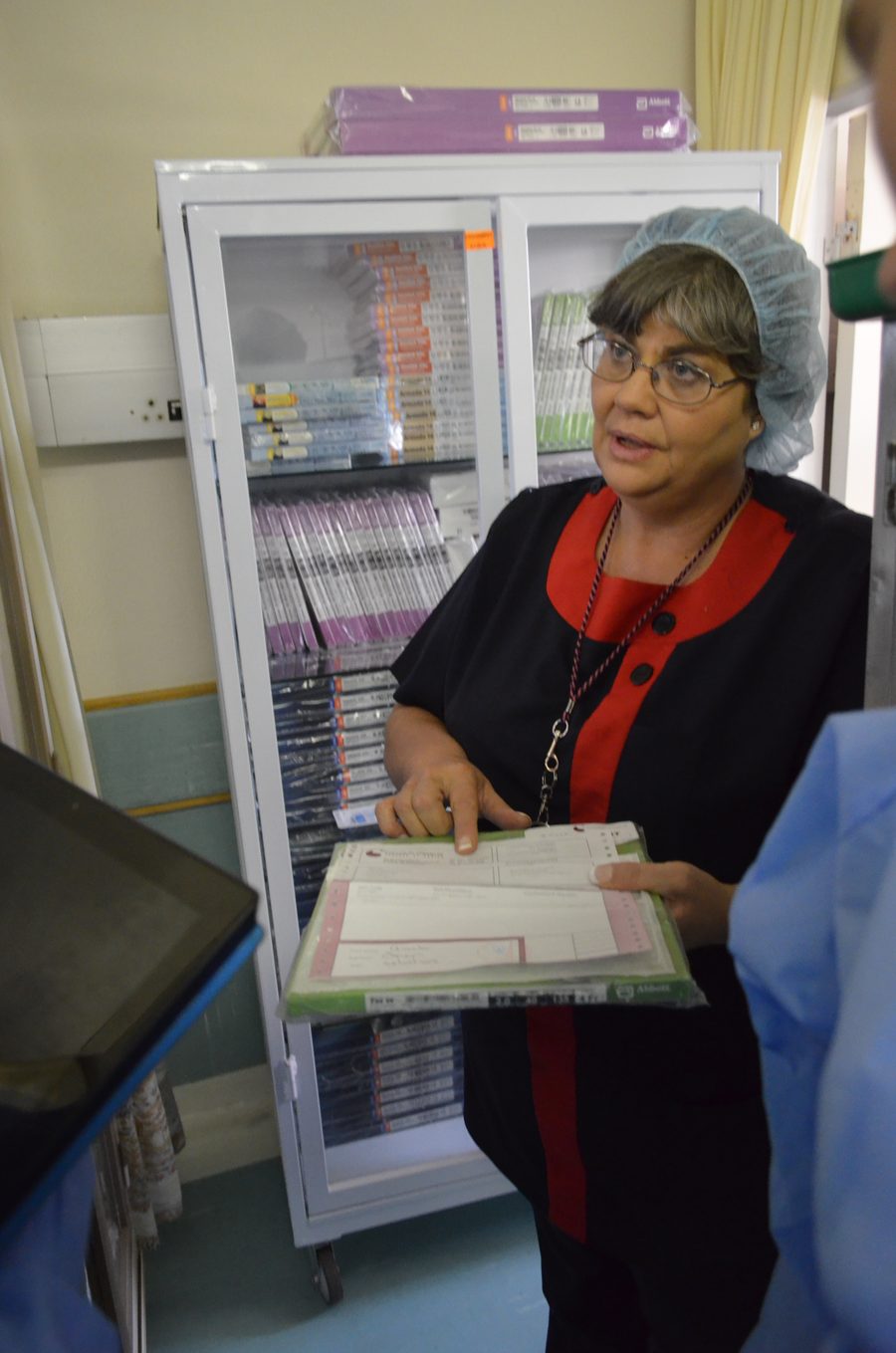
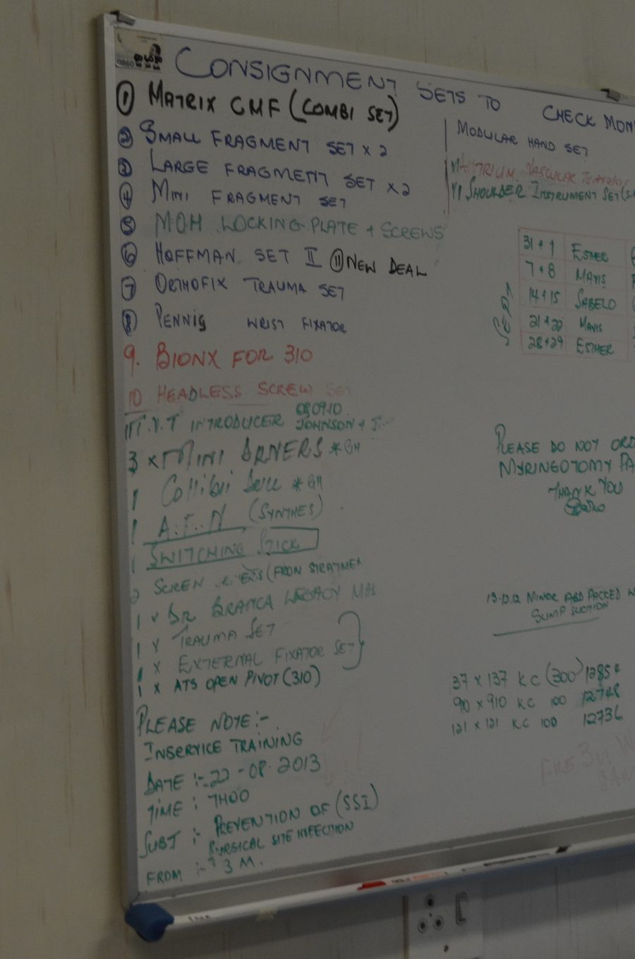
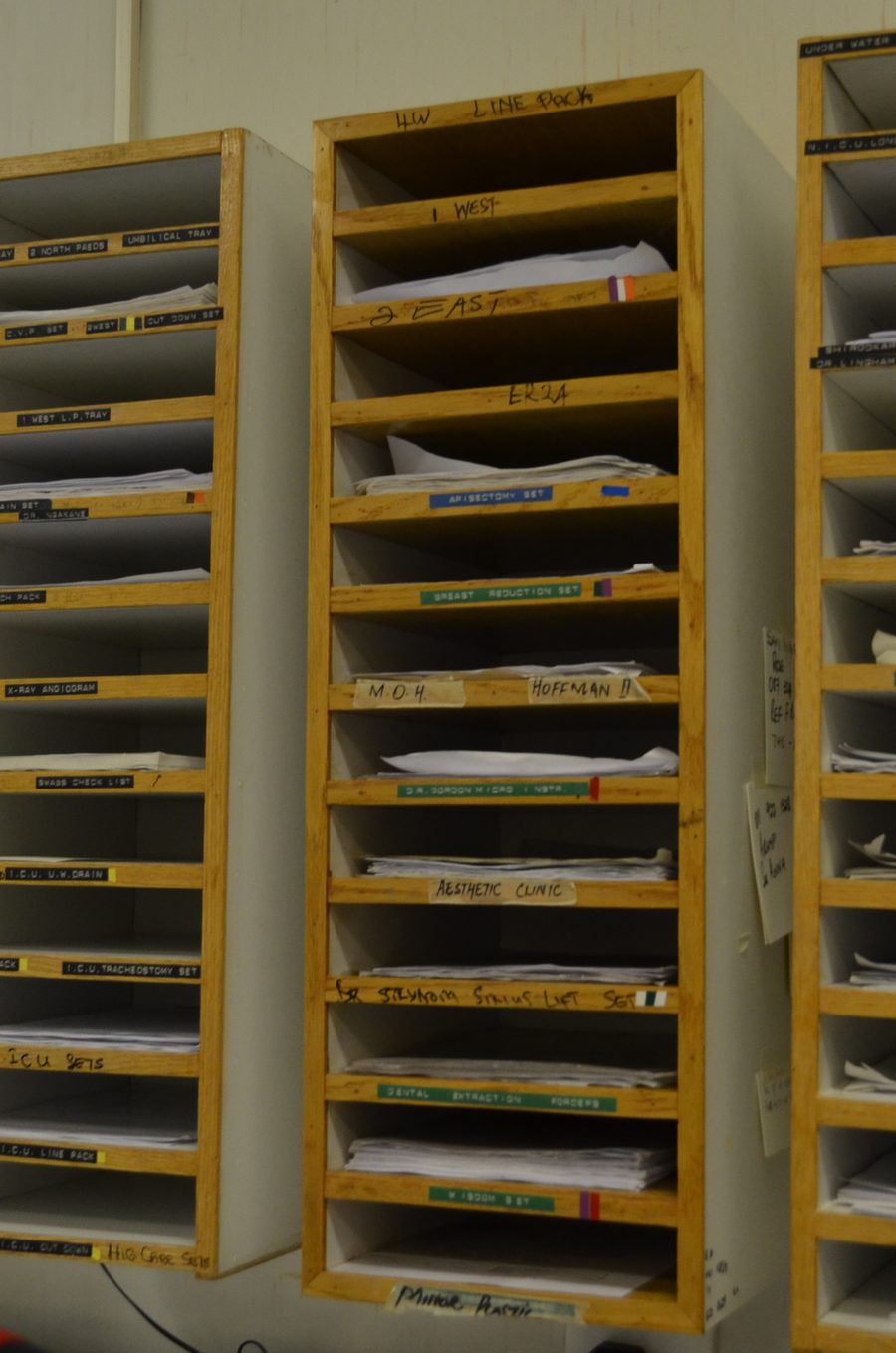
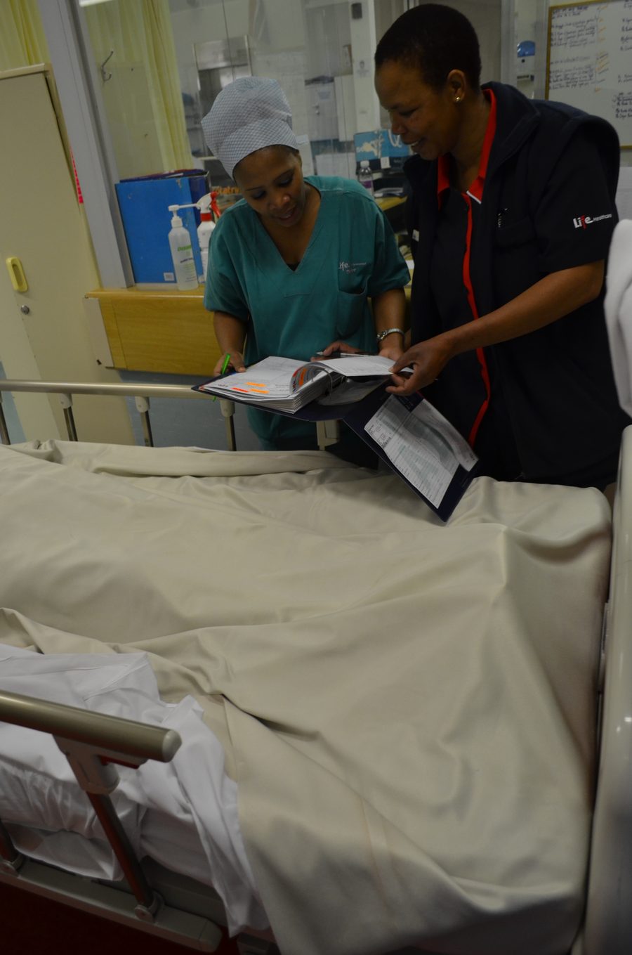
Before drawing a single screen, Origin spent time in Life Healthcare hospitals watching how staff actually ran a ward and a theatre floor: sitting with nurses at the medicine cabinet, in theatre stores, and beside the whiteboards, clipboards and index card boxes that already carried the operational memory of the place. Surgeons' preferences lived in a box of handwritten cards. Sterilisation cycles were logged on a paper form clipped to the autoclave. The theatre list for the day was rewritten by hand as patients moved and emergencies came in. None of that was inefficiency to be designed away. It was evidence of what a shared, walk-up display actually needed to be: legible at a glance, editable by more than one person, and trusted enough that staff would use it instead of falling back to a marker and a laminated board.
That research reframed the brief. A screen with individual logins would have broken the thing that made a whiteboard work, its openness, so the design instead treated the display as a public surface with a short clinician access code gating only the actions that mattered: moving a patient, blocking a bed, discharging someone, while the ward's status stayed visible to anyone who looked.
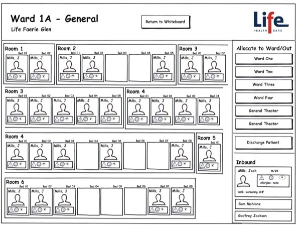
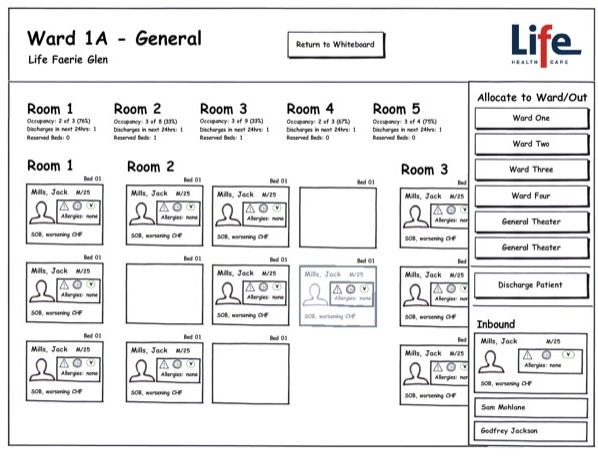
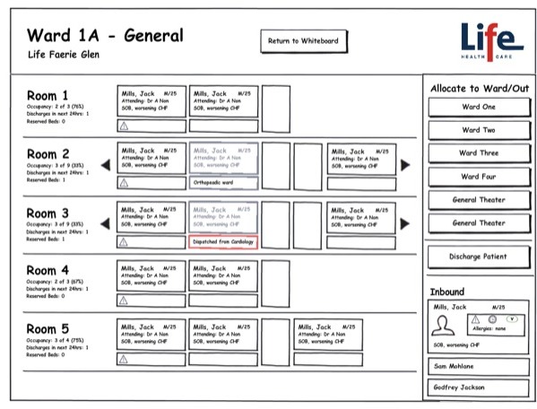
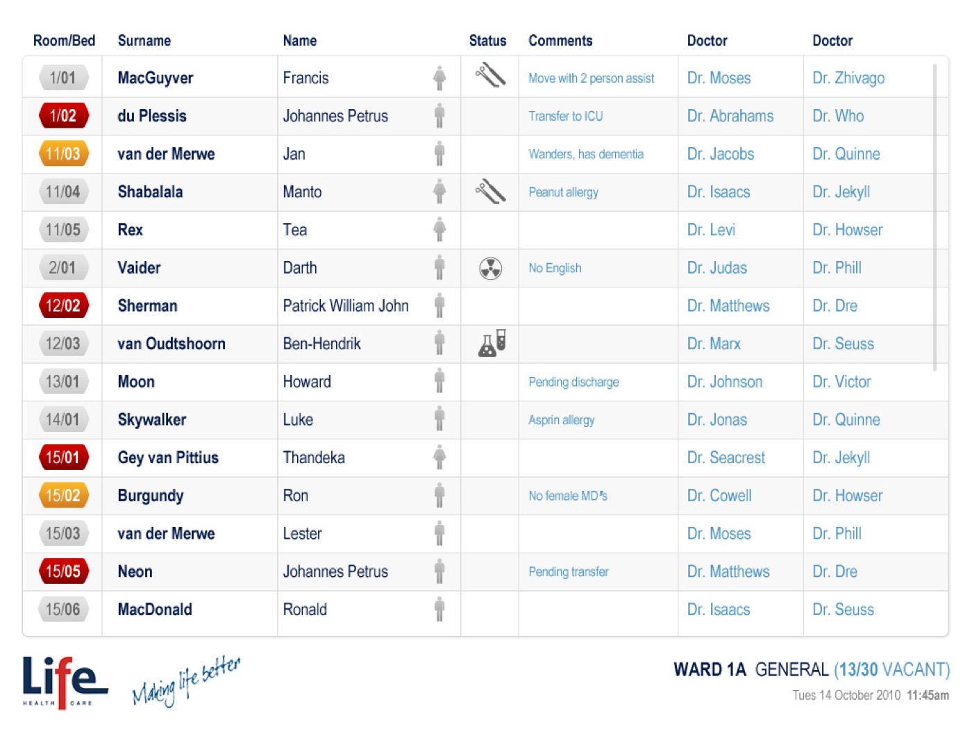
A resting state anyone can read: the screen defaults to a plain list of patients by room and bed, exactly what the paper whiteboard showed, before any access code is entered.
A PIN, not a login: a short clinician access code unlocks the actions that change patient data, without asking a shared screen to remember who is standing in front of it.
Real vacancy counts, not estimates: moving a patient opens a list of wards with their actual bed counts, so the decision is made against real information rather than someone's memory of who has space.
Confirm before it happens: every move, block or discharge asks for a plain-language confirmation naming the patient and the action, a guard against the wrong tap on a screen several people share.
What we shipped
The result is a ward census screen mounted at the nurses' station: a room and bed grid, colour coded for status, alerts and vacancies, an Accept Patient queue for admissions and transfers on their way in, and an In Transit and Returning panel tracking patients out at radiology, theatre or another department. Moving a patient opens the list of wards they could go to, each with its own vacancy count, and confirms the move by name before it happens. Blocking a bed, for cleaning or infection control, works the same way. Tapping any bed opens the patient behind it, their acuity, allergies, special instructions and recent attendance, everything a nurse needs before they act, without leaving the ward view for a separate system.
Outcome & value
The ward census screen was built and installed at Life Healthcare's nurses' stations as a shared display, carrying the ward's live status where every earlier version, a whiteboard or a laminated sheet, had needed someone to walk over and read it or update it by hand.
For nursing staff, the value was continuity. Nothing about the way they already worked, reading the board at a glance, updating it as things changed, more than one person touching it through a shift, had to be relearned, only the mechanism changed. For Life Healthcare, replacing the paper board with a live screen meant the ward's status was accurate as of the last update rather than the last time someone remembered to rub something out. Had the project stopped at a literal screen version of the whiteboard, built with individual logins and a single-user interface, the board would likely have gone unused, and the paper version, however out of date, would have stayed the one staff actually trusted.
In summary

Next steps
Trying to replace a process people already trust?
Let's talk about it.
Tell us what you're working on, what you're trying to achieve, what isn't working, or where you think there's an opportunity.