

- Client
- Mercedes-Benz Club (UK)
- Sector
- Membership · motoring
- Origin's role
- Research, IA, UX/UI design, front-end development, testing
- Requirements gathering
- Low-fidelity wireframes
- Information architecture
- UI design
- Responsive UI
- Front-end development
- Usability testing
- Member onboarding & payments
The challenge
The Mercedes-Benz Club is a members' organisation built around ownership: regional events, a technical resource library, club documents, a forum, the club gazette, classic cars for sale, and a history far longer than any website. The site had grown one addition at a time until it presented the whole of the club at once, roughly in the order the club had thought of things. Members did not arrive to take all that in. They came to check an upcoming event, renew their membership, find a technical document for their model, contact a regional organiser or read the latest gazette. The homepage was built to communicate the breadth of the club instead, and on a phone it was the same content compressed.
The real problem was that the club's structure had become the site's navigation. Members did not think in committees and sections. They thought in terms of their car, their region and what was on.
Our approach & thinking
Origin started with requirements gathering alongside the club: what the committee needed the site to do, what regional organisers needed to be able to publish themselves, and what members were actually contacting them about. That fed straight into research with members: interviews across regions and lengths of membership, a look at the site's search and support enquiries, and a card sort to see how members themselves group what the club offers.
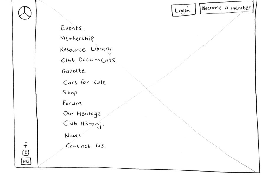
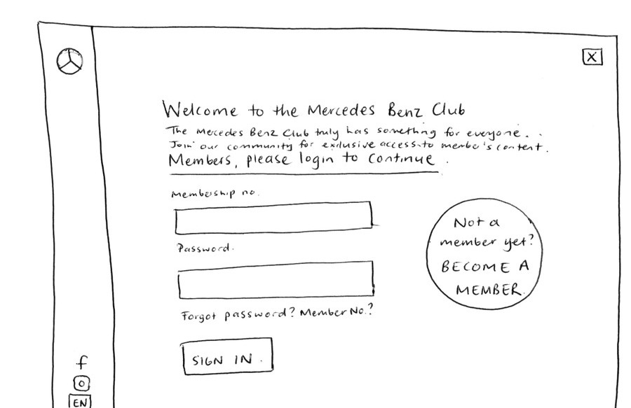
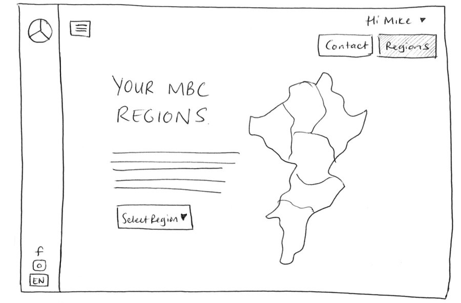
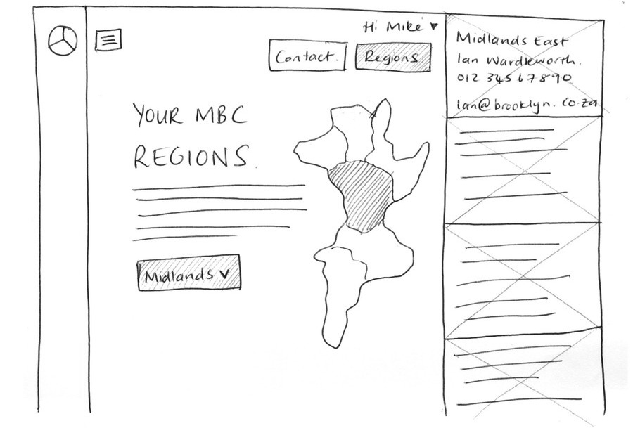
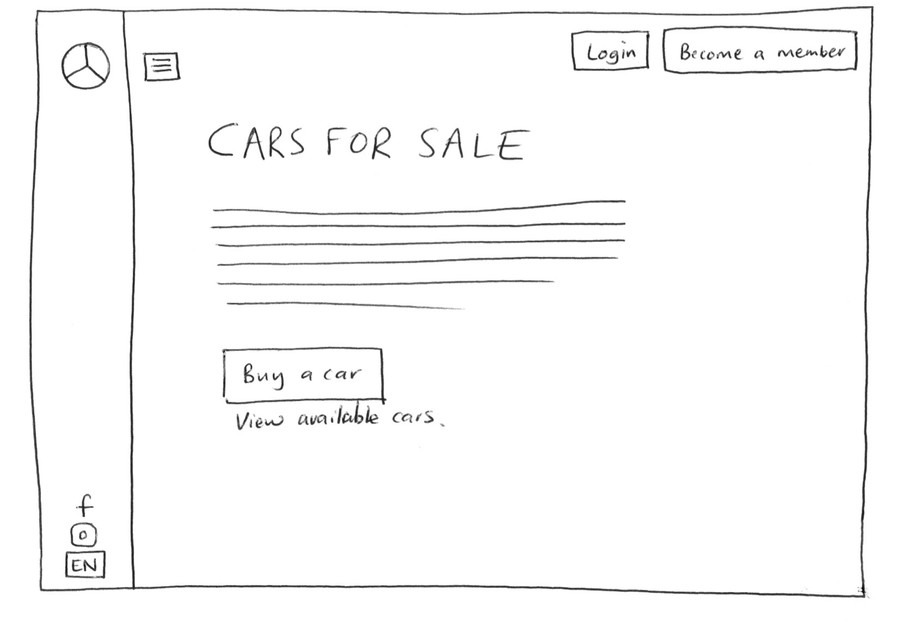
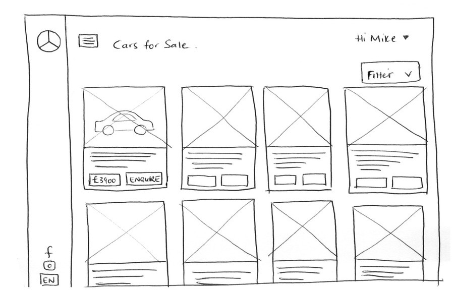
The structure was worked out on paper first. Low-fidelity wireframes set the content structure, the page layouts and the journeys a member would actually take, joining, renewing, finding a document, before any screen was designed in detail.
Signed in and signed out are different products. A member wants their events, their renewal and their resources; a prospective member wants to know what the club is and why to join. They stopped sharing a homepage.
An event is one thing, used everywhere. The same event component works in a national listing, on a regional page, in search results and in a member's own view, rather than being rebuilt per page.
The resource library gets a real search. Technical documents are found by model and year, replacing a nested folder structure that assumed you already knew where to look.
What we shipped
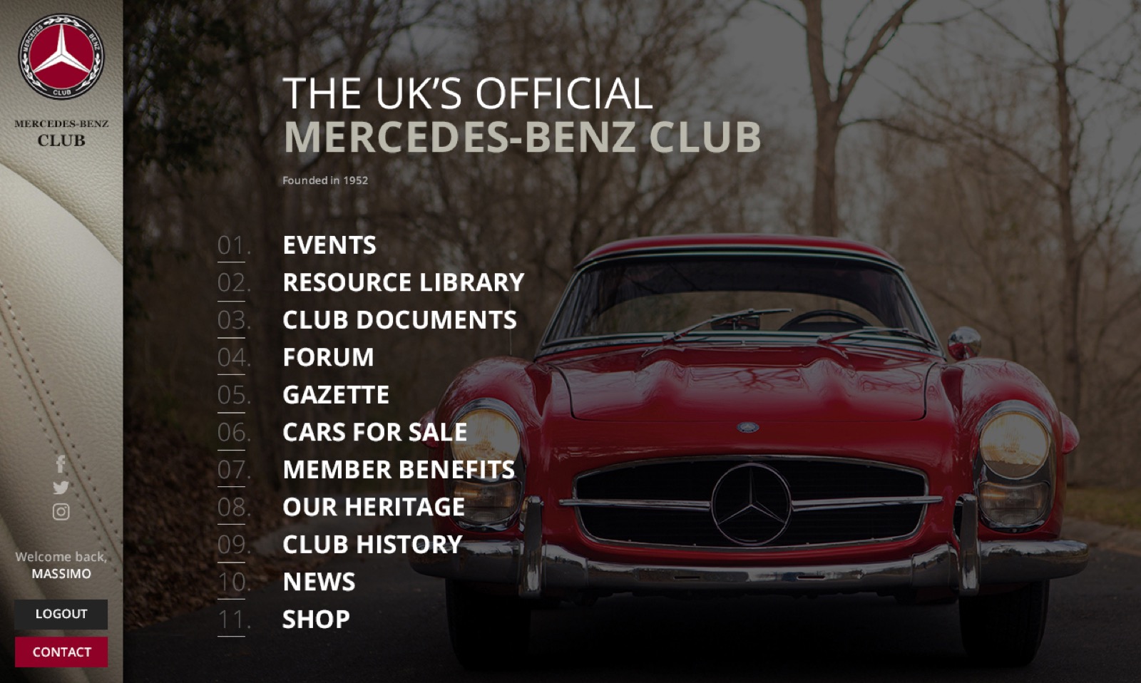
A responsive members' site organised around member intent. The signed-in experience opens on what is happening near you and what needs attention; the public experience concentrates on the club and joining it. Events, the resource library, club documents, the gazette and cars for sale each have a clear, direct route.
The interface was built as a small, disciplined component set with a fixed type and spacing scale, handed over so regional organisers could publish their own content without the design drifting over time.
Origin designed and built the front end, and delivered the project end to end: usability testing with members before launch, and testing across browsers and screen sizes so the site held up on whatever a member happened to be using.
Joining and renewing were built as one flow rather than two: a prospective member can join, and an existing one can renew, through the same short process, membership details and payment included, instead of a separate form bolted on afterwards.
Outcome & value
Members reach what they came for in fewer steps, on the phone most of them actually use, and the club has a site it can keep extending without the navigation collapsing under each new section.
Had it kept growing outward from the club's own structure, every new initiative would have added one more item to a homepage members were already scrolling past to find the thing they came for.
Origin ran the project from that first requirements conversation through to a live, working site, and it is now the one members across the UK use to join, renew and stay in touch with their region.
In summary

Next steps
Has your site grown to show everything you do?
Let's talk about it.
Tell us what you're working on, what you're trying to achieve, what isn't working, or where you think there's an opportunity.