
- Client
- FNB
- Sector
- Banking · retail
- Origin's role
- Research, concept, wireframing, UX/UI design, interaction design, development, device deployment
- Human-centred design
- Concept design
- Wireframing
- UX design
- UI design
- Microsoft Surface
- Multi-touch interaction
- Multi-user design
- Product storytelling
- Front-end development
- UAT testing
- Device installation support
The challenge
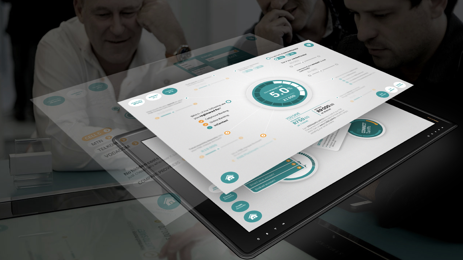
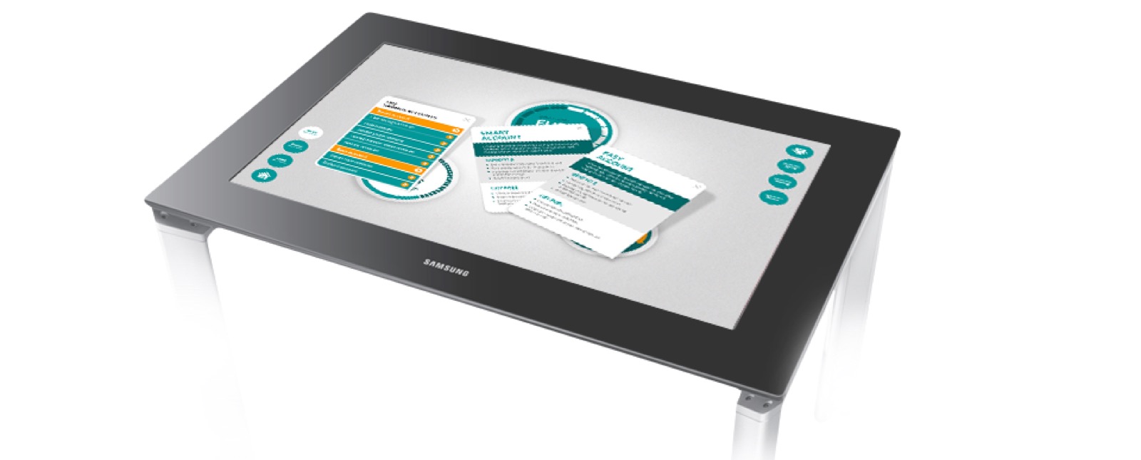
FNB commissioned an interactive experience for a Microsoft Surface table, the large multi-touch screen built into a table top, for its concept stores, a new in-person format the bank was rolling out countrywide. The point was to help customers understand what they could actually get from FNB's different services and products, at their own pace, instead of being talked through a folder. A table screen is not a phone or a website. Several people stand around it at once, each reading from a different side, each reaching in with their hands. There is no single right way up, no login, no one clear owner of the session. Most interface conventions assume one user facing one screen, and none of them hold here.
The products themselves, cheque accounts, fuel rewards, the eBucks rewards programme, foreign exchange through FNB Connect, are not hard to grasp one at a time. The real problem was letting a group compare them, pull the interesting ones closer, and follow a thread of curiosity together around a shared surface.
Our approach & thinking
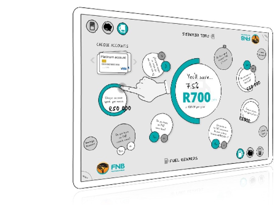
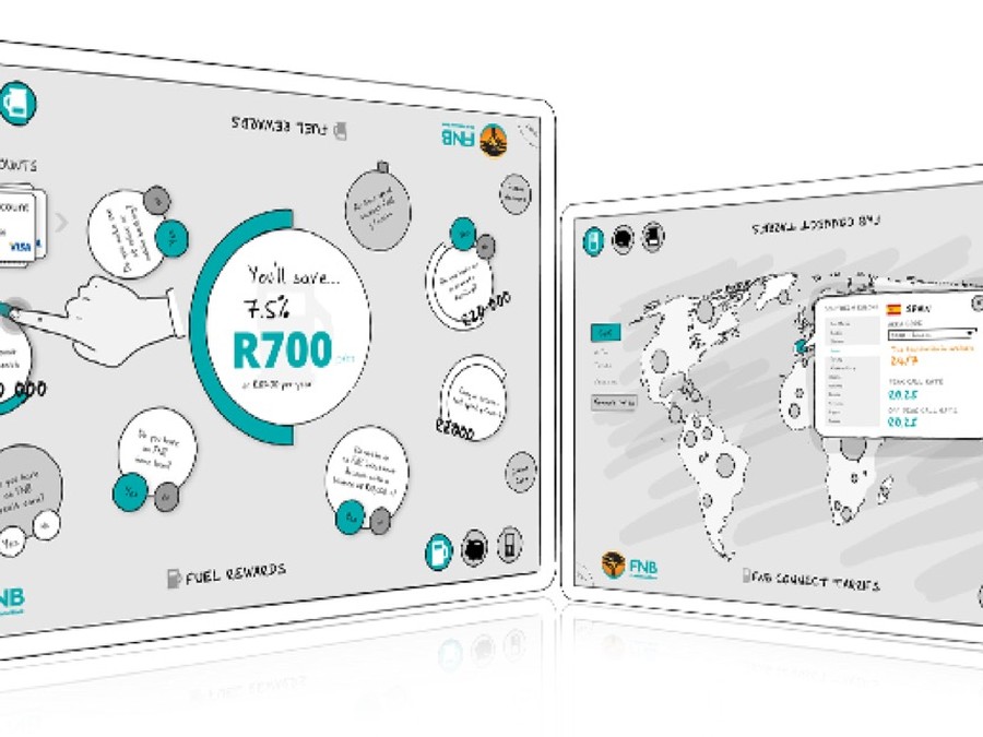
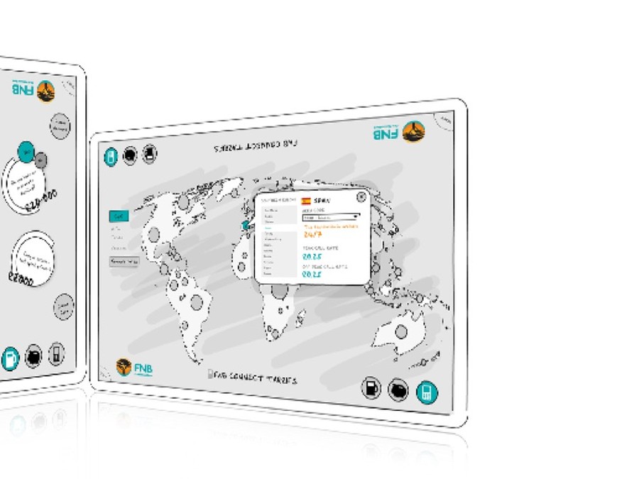
Origin started with concept work and wireframes, working out what belonged on the table and how a group would actually move around it, before any visual design began. Content was built as objects that any person at the table could take hold of, turn towards themselves and open.
No right way up. Product cards, calculators and the world map rotate and move, so the person on any side of the table can bring something to face them.
Several hands at once. The interface expects simultaneous touches from different people and never locks the whole surface to one action.
Objects, not menus. Each product is a physical-feeling card that can be dragged out, compared beside another, and pushed aside, the way you would spread brochures on a real table.
Numbers you can play with. Where a product has a calculation, such as what a cheque account saves, a bond repayment, an investment return or a foreign exchange rate, it is a small interactive tool on the table rather than a static figure.
What we shipped
A Microsoft Surface experience for FNB where a group can explore cheque accounts, fuel rewards, eBucks and FNB Connect foreign exchange together. Product cards can be pulled from the edges of the table, opened, compared and rotated to any seat. A world map lets people check live exchange rates for a destination. Small calculators show what a choice is worth, including what a bond repayment or an investment product would actually cost or return.
The visual language was kept light and tactile so the table read as something to touch and move rather than a screen to watch, and so it worked under the bright, busy conditions of a concept store floor.
Origin built the experience as well as designing it, and supported the team installing it, getting the application running on the Microsoft Surface devices themselves as stores opened around the country.
Outcome & value
FNB had an in-person product experience that did not depend on a consultant being free, and that let a couple or a family work through options together at their own pace. Rolled out to concept stores countrywide, the table drew people in and gave branch staff a shared surface to explore products with a customer rather than across a desk.
Without it, exploring FNB's range in a concept store would have stayed a one-to-one conversation over printed material, reaching one person at a time and only while a consultant was available.
In summary

Next steps
Do people need to explore your products together, not one at a time?
Let's talk about it.
Tell us what you're working on, what you're trying to achieve, what isn't working, or where you think there's an opportunity.