
- Client
- Standard Bank
- Sector
- Banking · retail
- Origin's role
- Research, human-centred design, information design, UX & UI
- Windows 8 app
- Panoramic hub
- Snap-view multitasking
- Branch & ATM locator
- Payments & statements
The challenge
Standard Bank was building a banking app for Windows 8, for the tablets and touch laptops running Microsoft's then-new operating system. Windows 8 had a strong visual language of its own: wide panoramic layouts, live tiles, a settings panel that slid in from the edge, and a snap view that let one app run in a narrow column beside another. The easy option was to take an existing phone or web design and resize it. That would have produced an app that ignored everything the platform expected and felt foreign on the device.
The real problem was fitting real banking, checking balances, moving money, paying people, reading a statement, finding a branch, into a layout and a set of interactions that were unfamiliar to design for and that most of the bank's customers had never seen.
Our approach & thinking
Origin designed the app to the Windows 8 design language rather than around it, so it felt native to the device while still being unmistakably Standard Bank.
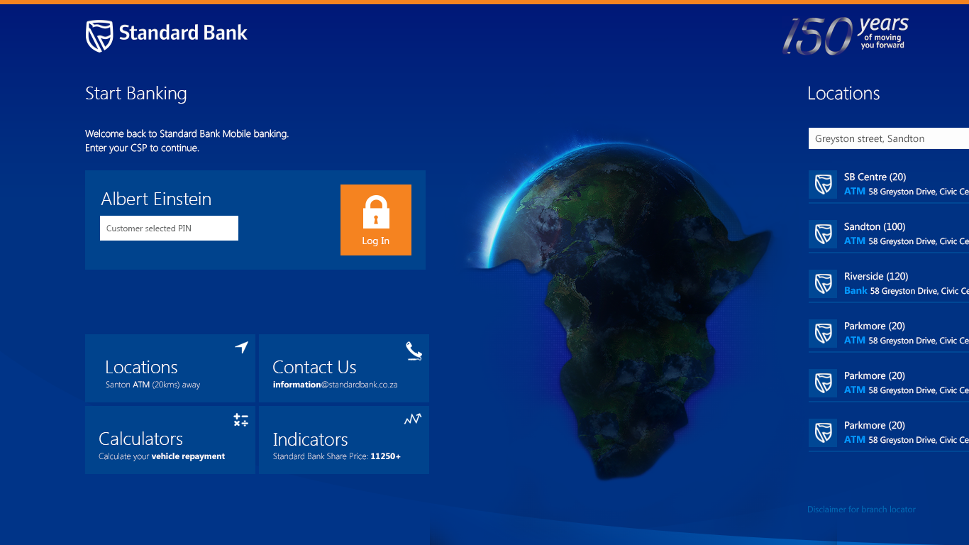
A panoramic hub. The home experience is a single wide surface you pan across: start banking, branch and ATM locations, contact numbers, calculators and market indicators, before you ever sign in.
Public before private. The things you do without logging in, finding a branch, running a repayment calculator, checking the share price, are available immediately; banking sits behind sign-in.
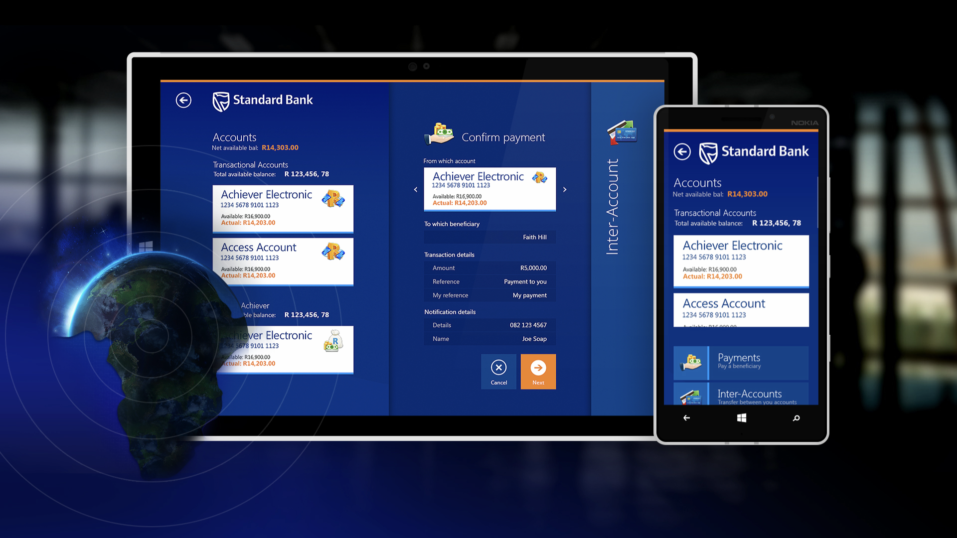
Designed for snap view. Key screens have a narrow layout so a customer can keep their accounts visible in a column while working in another app.
Payments as comprehension. The confirmation step states who is being paid, how much and from which account in plain terms before anything is sent.
What we shipped
A Windows 8 banking app with a panoramic hub covering pre-login utilities, a branch and ATM locator with a map, finance calculators and live market indicators, and, behind sign-in, accounts, statements, payments, inter-account transfers, prepaid purchases and send-money. The edge settings panel and snap view are used as the platform intends.
Every screen was built in the platform's typographic, tile-based style, tuned to Standard Bank's identity, so the app read as part of Windows 8 and part of the bank at the same time.
Outcome & value
Standard Bank had a banking app that belonged on a Windows 8 device rather than one that looked ported to it, with the everyday tasks reachable and the platform's multitasking and edge interactions working as customers of that platform expected.
Had the app simply reused a phone design, it would have sat awkwardly on the device, ignored snap view and the edge panel, and given customers on that platform a second-class version of their bank.
In summary

Next steps
Is your app built for its platform, or just resized to fit it?
Let's talk about it.
Tell us what you're working on, what you're trying to achieve, what isn't working, or where you think there's an opportunity.