

- Client
- AstraZeneca
- Sector
- Healthcare · pharmaceutical
- Origin's role
- Experience architecture, UX & UI design, information architecture
- Information architecture
- Navigation redesign
- User experience design
- User interface design
- Design system
- Mobile-responsive design
The challenge
AZ Engage is AstraZeneca's learning and development platform for healthcare professionals: accredited courses, training and educational content that doctors, pharmacists and nurses work through to earn continuing professional development points. Those points are not optional extra credit, they are what keeps a medical licence active. Losing track of them has real consequences for a doctor's ability to keep practising.
The platform already existed and was already live across multiple African and Middle Eastern markets, with thousands of registered healthcare professionals depending on it. Origin was engaged to rework its experience, not to reskin it, but to rebuild how doctors moved through it. The stated brief was a visual refresh. The real opportunity was structural: the content was genuinely good and properly accredited, but the navigation buried it behind a layout that made no distinction between a two-minute product update and a ten-question accreditation worth real CPD points.
The real problem
The obvious read was that AZ Engage needed a modern coat of paint. The actual problem was that its content library, accreditations, training, education, courses, live events, had grown faster than its navigation had grown to organise it. Everything technically had a home, but nothing had a hierarchy. A doctor logging in with fifteen minutes between patients had no fast way to find the one accreditation closest to completion, or to tell it apart from thirty-eight other pieces of content competing for the same screen.
The sharper problem: this was not a design system gap, it was a wayfinding gap. Doctors needed the platform to tell them where they stood and what to do next, on one screen, without navigating.
Our approach & thinking
The breakthrough came when we stopped treating the homepage as a content directory and started treating it as a status report. The moment the overview screen led with progress, such as accreditations completed against accreditations available, instead of a grid of tiles, the platform stopped asking doctors to browse and started telling them exactly where they stood.
Left-hand navigation paired with sticky top tabs: doctors could always see which section of the platform they were in, while a persistent top bar broke that section down further by content type, so switching between Accreditations and Live Events never meant losing your place.
One screen carried the whole status picture: progress against every content type sat together at the top of the overview, above the content grid, so the platform answered where a doctor stood before it asked what they wanted to browse.
Content collapsed onto a single flow: watching a video, reading supporting material and answering the accreditation's questions became one continuous screen instead of separate systems a doctor had to move between and lose progress in.
Specialist category filtering: with content spanning cardiovascular, diabetes, oncology, respiratory, renal and half a dozen other therapeutic areas, doctors could narrow the entire platform to their own specialism in one tap.
What we shipped
The rebuilt AZ Engage gave every doctor a single overview screen that led with their own progress: accreditations, training, education and courses tracked against clear totals, with the content closest to completion surfaced first. Below it, the same content organised by specialist category and by type, filterable without a page reload.
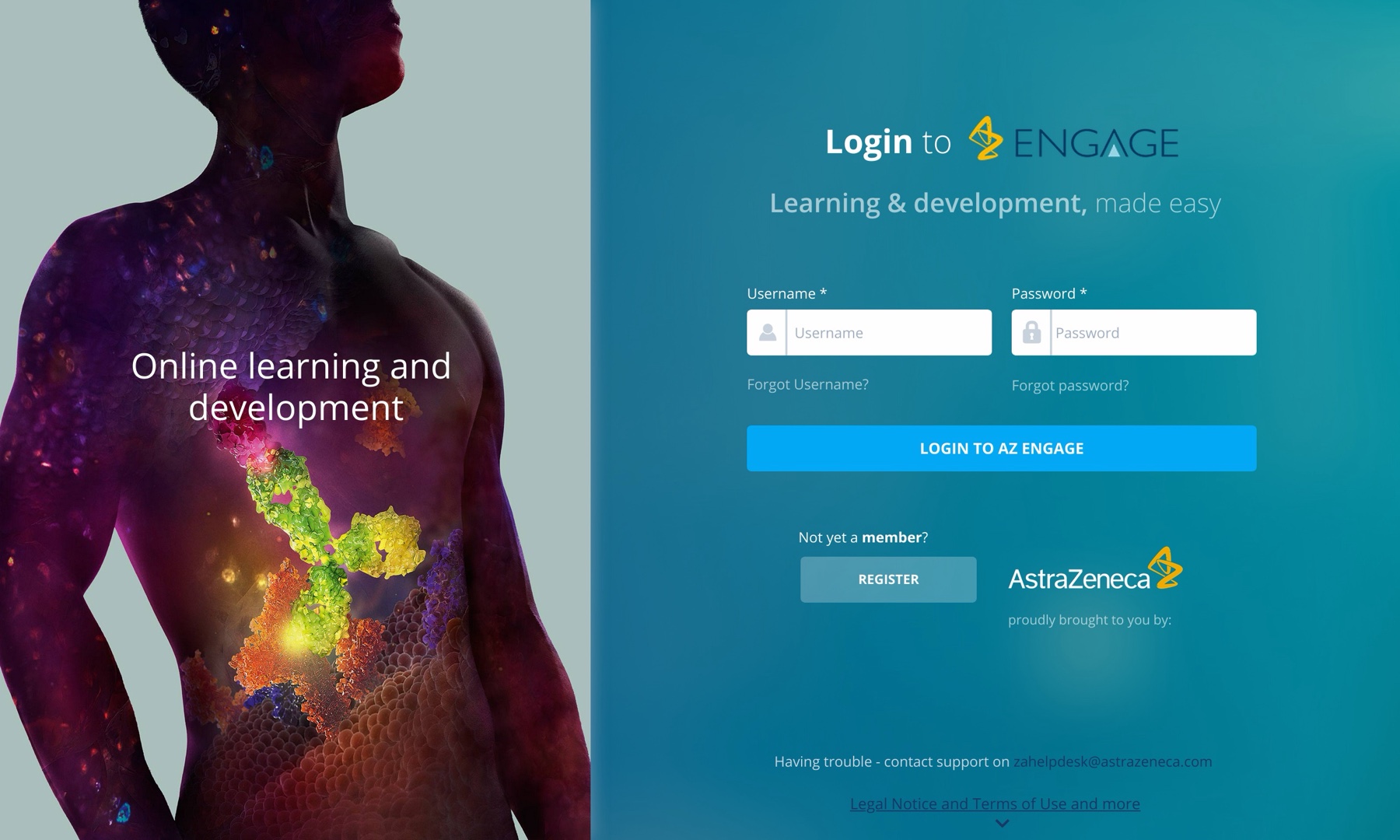
Accreditation itself became one flow, instructional video, supporting material and a ten-question assessment in sequence, with a visible progress bar and a clear pass threshold, ending in a downloadable certificate tied to that accreditation's specific CPD points. A dedicated certificates screen gave doctors everything they had earned or were working towards in one filterable list, ready to submit to their own country's accreditation body. The registration flow opened with a country selector spanning the programme's African and Middle Eastern footprint, and every screen was rebuilt to work identically on mobile, where a meaningful share of healthcare professionals were actually opening the platform.
Outcome & value
AZ Engage relaunched across its existing markets on the new navigation and content framework, with the platform's country footprint continuing to expand into new African and Middle Eastern markets after launch. The underlying content library and accreditation logic stayed exactly as accredited; what changed was a doctor's ability to find their way through it.
For the doctors using AZ Engage, the redesign turned a platform they had to work at into one that worked for the time they actually had. A clearer path from login to accreditation to certificate meant less of a healthcare professional's limited free time was spent navigating and more of it was spent learning. For AstraZeneca, it meant a platform serving thousands of registered healthcare professionals across fifteen-plus countries could keep scaling its content library without the navigation collapsing under its own growth. Had the old structure remained, that expansion would have compounded the problem rather than solved it, more content, more countries and more doctors funnelled through the same navigation that already couldn't tell a two-minute update from a CPD-bearing accreditation. Doctors would have kept losing time they didn't have, and some would have quietly stopped coming back, taking their continuing education elsewhere and putting their own accreditation status at risk.
In summary

Next steps
Building something people have to keep coming back to?
Let's talk about it.
Tell us what you're working on, what you're trying to achieve, what isn't working, or where you think there's an opportunity.