

- Client
- Elle
www.elle.health - Sector
- Healthtech · medical practice management
- Origin's role
- Requirements gathering, user research, competitor analysis, wireframing, UX & UI design, mobile app design
- Requirements workshop
- Stakeholder alignment
- User interviews
- Competitor analysis
- Wireframing
- UX & UI design
- Responsive UI design
- SaaS framework design
- Onboarding design
- Multi-practice architecture
- Mobile app design
The challenge
Medical practices in South Africa bill medical aids and patients through software most of the people using it describe as archaic. Claims are submitted, rejected, corrected and resubmitted. Short payments have to be chased. Reconciliation between the medical aid, the patient and the practice account is manual. The work sits with practice administrators, and in many practices one person books the diary, registers patients, raises the invoices, follows up the claims and runs the accounts.
The client set out to build a better platform: book and bill in real time, on the web, simple enough to use without training. Origin was asked to take it from a rough proposition to a designed product, then design the practice-facing platform and a companion patient app. The stated goal was to make medical billing easy. The obvious brief, then, was to simplify a complex process. Working through the requirements told a different story. The people who would decide whether the product lived or died were practice administrators, and the client's own evidence described them as older, not confident with technology, wary of the switch and often content with the process they already knew. Several were working in their second language. A simpler billing engine, presented as another unfamiliar system to learn, would never get through the front door of the practice.
Requirements gathering
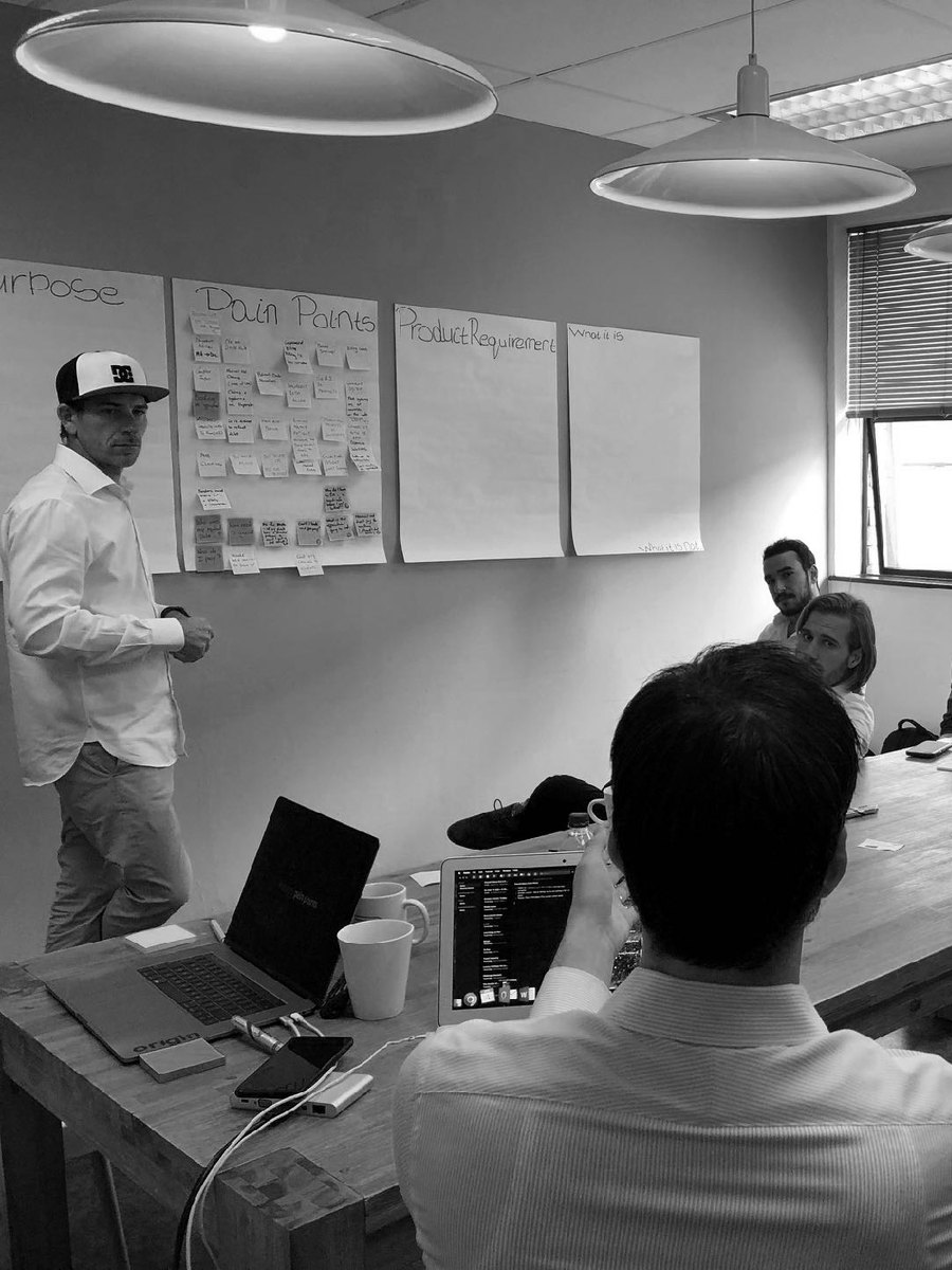
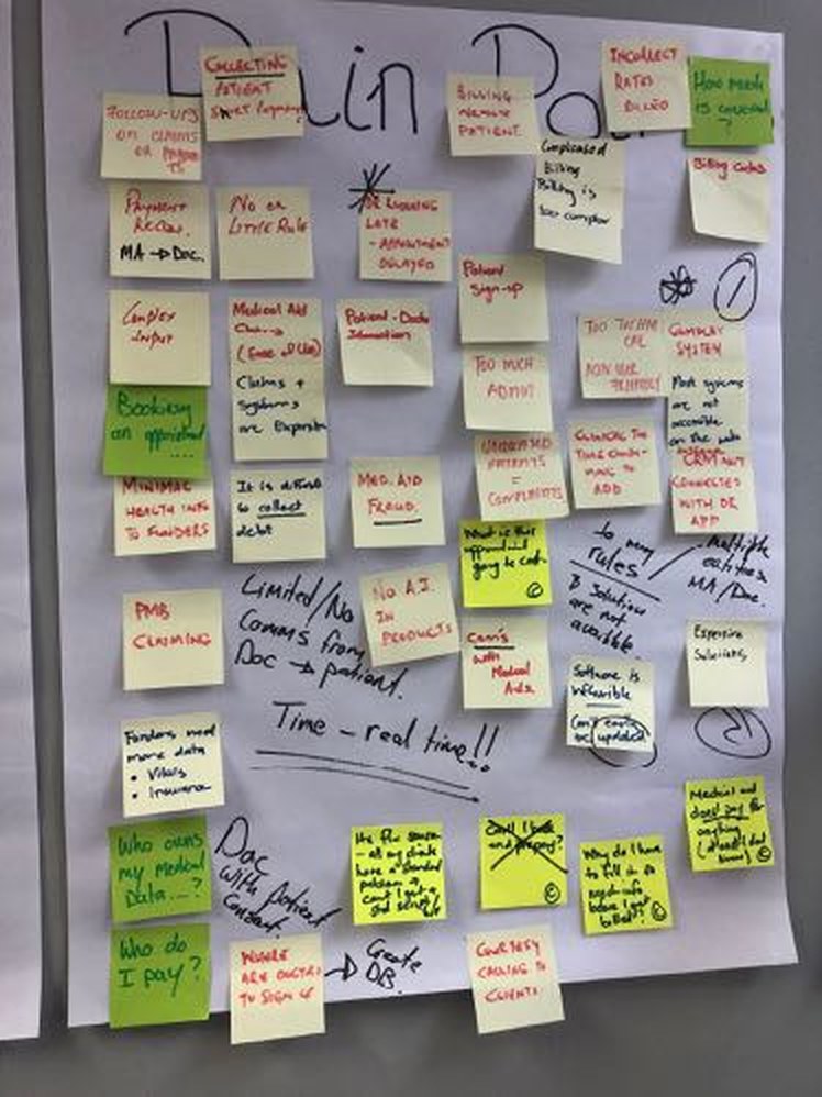
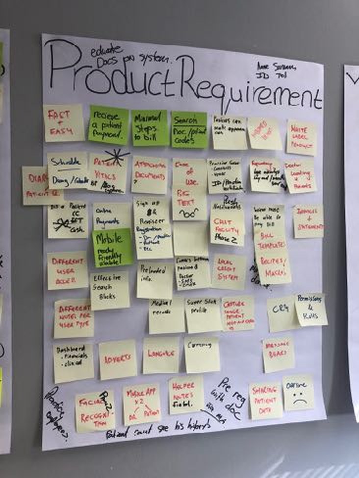
Origin ran the project as a sequence: understand, then research, then draw, then design. It started with a requirements gathering workshop with the client's stakeholders in April 2019. The session separated business, product, user and technical requirements and forced agreement on priorities. It mapped the current billing and payments processes step by step, from registering a patient to submitting a claim and allocating a payment, and listed the pain points felt by the practice, the patient and the medical aid. It asked directly who the users were, why they would use the product and why they would not.
The answers were specific. Making medical billing easy and being able to book and bill in real time ranked first, and the reasons for non-adoption were on the wall from the first week: older staff, not confident with technology, and happy with the process they already had. That list set the terms for everything that followed, because a better billing engine would only matter if those people were willing to move to it.
User interviews & competitor analysis
The interviews took us into real practices. We sat with practice administrators and finance staff and asked how they actually work: which devices they use, which systems they keep open all day and where the process lets them down. Each interview followed the same structure, from the person's role and experience with technology to bookings, working with doctors and billing, so the answers could be compared.
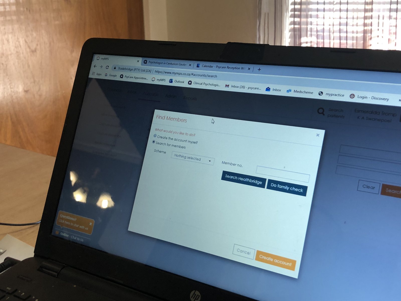
Many of these practices ran on a competing product, so the visits doubled as a competitor analysis. We went to other healthcare practices, saw which competitor products they used, and shadowed the staff, who took us through the journeys, the functionality and the features of the systems they work in every day. We photographed the screens as they went. The photographs show what the new product was up against: dense forms, dialogs stacked over dialogs and a confirmation at almost every step. They also showed how much the people using these systems already knew, which set the bar for how learnable the new one had to be.
The turning point
The shift came during the user interviews. Sitting with practice administrators, one of whom described her job as “running the entire practice”, made it clear that the product was not a doctor's tool with an admin function bolted on. The administrator's day was the product. Once the team designed for her sequence of work, registering a patient, getting them seen, raising the invoice, submitting the claim, chasing what came back, the doctor's needs mostly fell into place inside it.
Wireframes
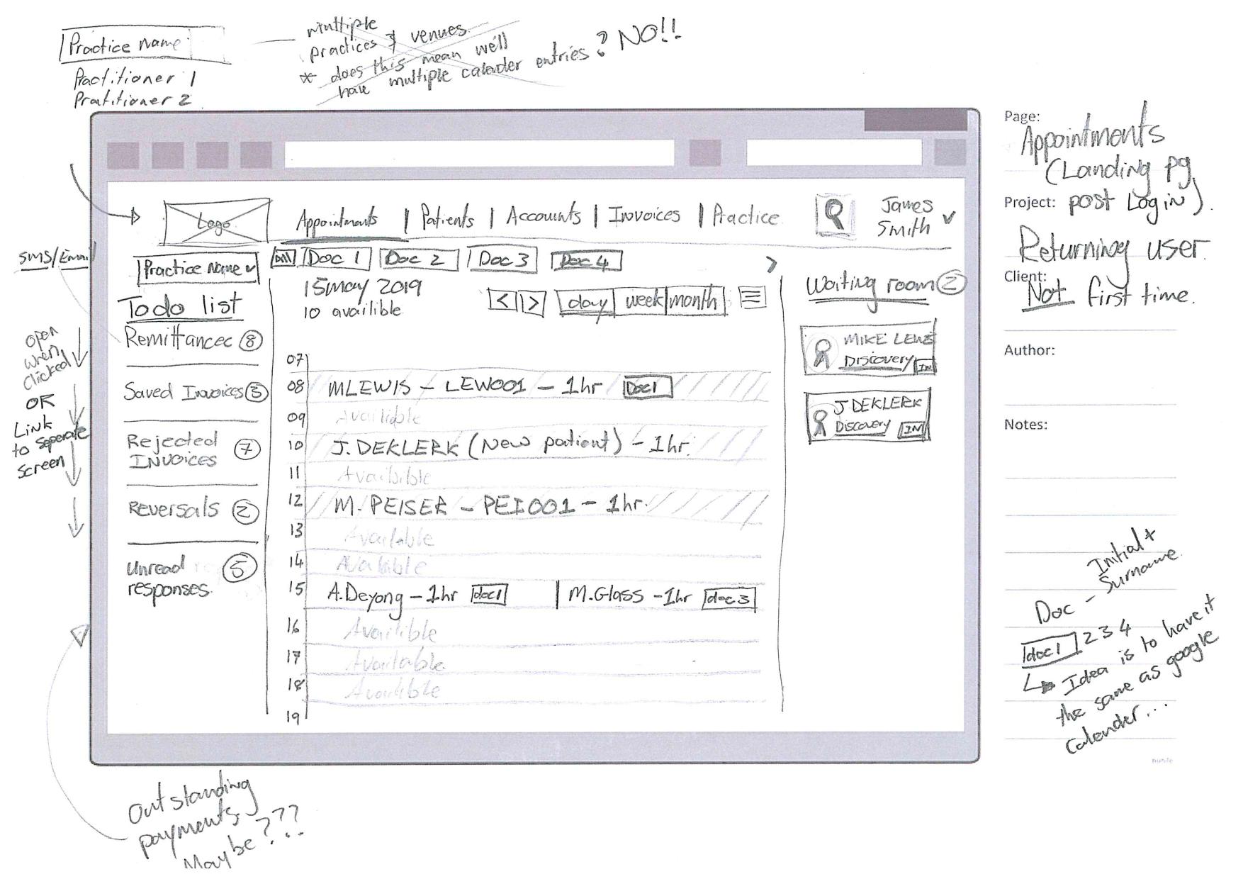
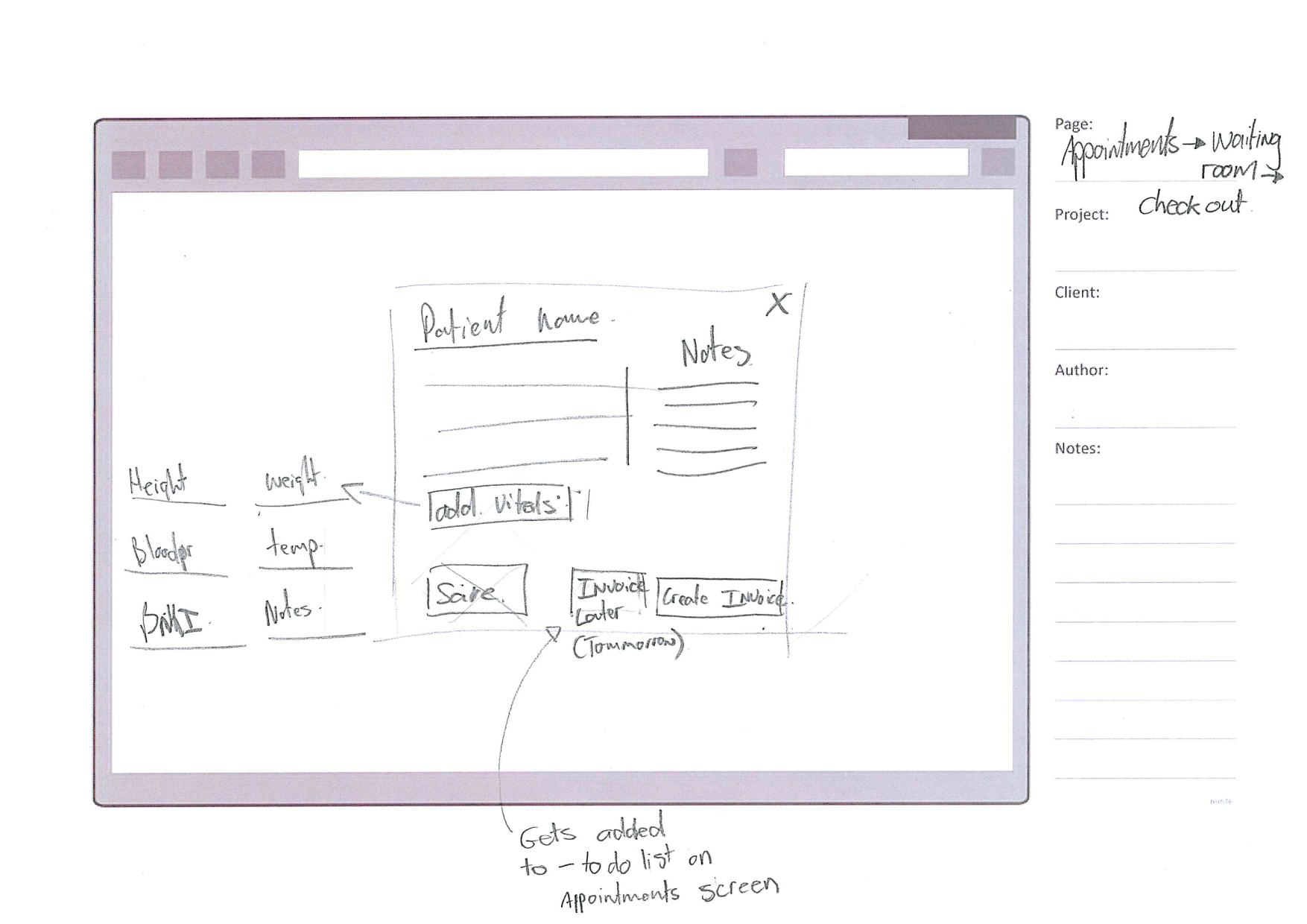
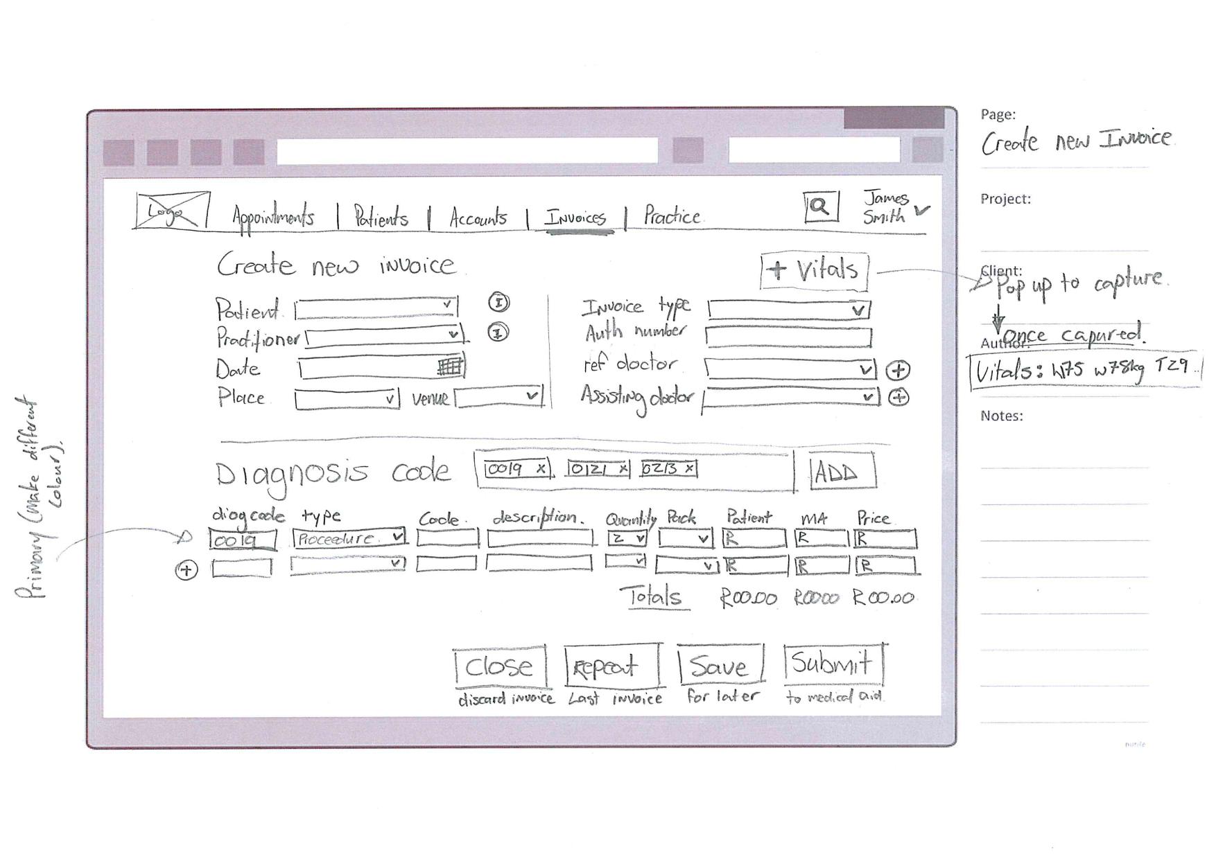
With the requirements and the interviews in hand, we moved to low-fidelity, annotated wireframes to define the framework of the platform before any visual design started: the content structure, the information hierarchy and the information architecture. They worked through onboarding, the appointments day view, capturing a consultation and building an invoice.
The appointments wireframe settled the shape of the whole platform: the day in the middle, outstanding tasks on one side and the waiting room on the other, so the administrator can hold the state of the practice on one screen.
What we shipped
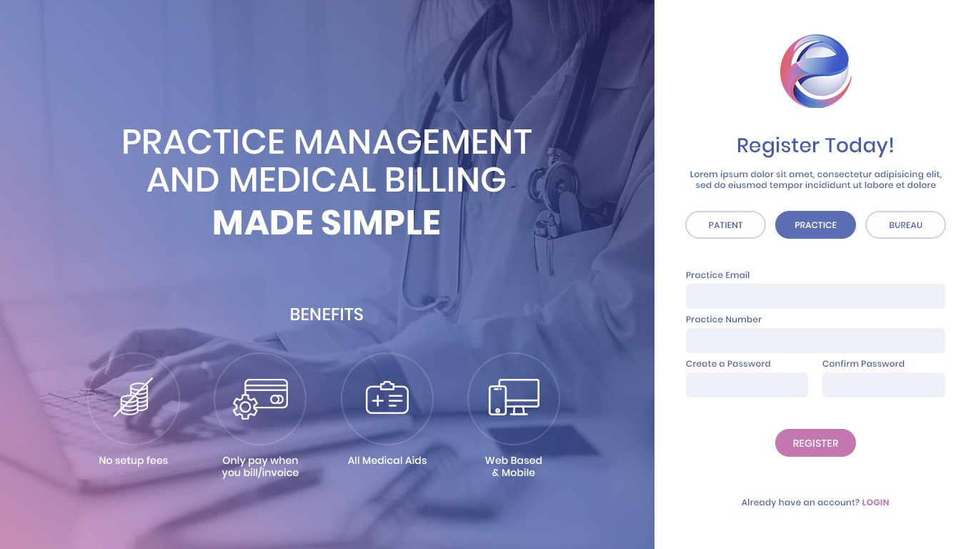
Onboarding is the first thing anyone meets, so it had to be the simplest. Elle can be joined as a patient, a practice or a bureau, and the register screen makes that choice the first thing you do, next to a short panel of plain benefits. For a practice, setup then runs as a guided sequence with one question to a screen and a list of steps down the left that always shows where you are.
The welcome screen says roughly how long setup will take. Each screen asks for one thing, starting with the practice name, then the type, the number and the address. Someone who is interrupted can stop and finish later, and the sequence ends on a confirmation that offers a short tour of the platform. For an administrator who expected weeks of forms and training, the aim was to remove every reason to put the switch off.
Inside the practice
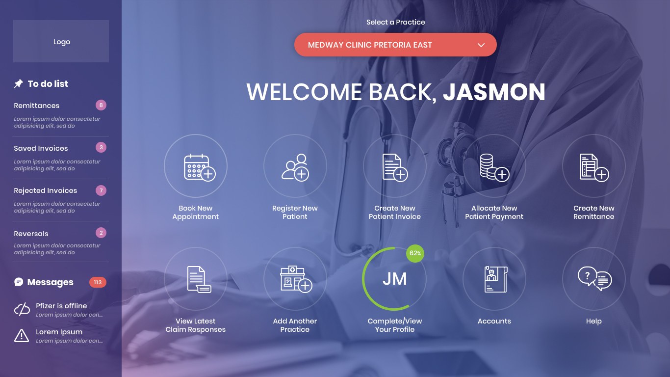
Once a practice is set up, the platform is built around the administrator's day. The dashboard opens on the actions staff take every day, with the to-do list and messages beside it. Appointments run as a day view flanked by tasks and a live waiting room, filterable by practitioner, and opening an appointment brings the patient's details and vitals forward without leaving the diary. Registering a patient captures only what is needed to bill.
The invoice is a single form with diagnosis codes and line items added in place and running totals as they build. Saved templates cover common conditions, and sheets let staff prepare several invoices away from the live billing flow. The invoice list keeps rejections and short payments visible, and bulk actions let an administrator filter overdue accounts by age and amount and email or SMS the whole group at once.
The later Elle work extended the same thinking: a patient workflow board moving people through appointment, waiting room, assessment and admin, and a patient record that holds details, appointment history, vitals, notes and attachments on one screen. Throughout, the design assumes the person in front of it is busy, is not a power user, and needs the system to hold the detail so they do not have to.
Origin also designed the SaaS framework the product now runs on, built as a multi-practice patient management system rather than a single-practice tool. That framework covers doctor management and calendar management across practitioners, in-consultation room management for the moment a patient is actually being seen, and patient and account management for everything before and after the appointment. Billing and invoicing templates, and a separate set of email templates, let a practice set up its common conditions, line items and correspondence once and reuse them on every invoice or bulk send after that, so the system gets faster and more familiar the more a practice returns to it rather than staying a one-size form.
The mobile app
Elle Connect is the mobile app that takes a consultation beyond the practice, so a practitioner and a patient can meet by video without either of them travelling. Origin designed the screens for the parts of the journey that a patient meets on a phone: joining the call, finding an earlier consultation and getting help when something does not work.
The call itself is a full-screen video view with only the controls a patient needs, and a history keeps earlier consultations easy to find. A help centre sits inside the app for the common problems, from joining a meeting to sound and camera. It carries the same visual system as the web platform, so a patient moving between them meets one product.

Outcome & value
The engagement produced the requirements base, the research, the wireframes and the full interface design the product was built from, and the design system carried through the CausalNexus to Elle rebrand rather than being redrawn. The workshop findings and the interview insights continued to steer decisions well past the design phase, because they were specific enough to settle arguments about scope and priority.
For practice administrators, the value is a system that follows their actual sequence of work and does not assume technical confidence: registering a patient, seeing them, billing, and chasing what the medical aid sends back are treated as one connected flow, with the interface holding the running state. For the business, designing for the reluctant adopter first is what makes the goal of thousands of practices on one platform realistic, because each new practice costs less to bring on when the product can be learned without training. Had the project stayed focused on the billing engine alone, the likely result was a technically better system that practices declined to adopt, rejected by the administrators who were already, on the client's own evidence, hard to convince and easy to lose.
Elle is still in daily use today, and it has grown well beyond billing. Practices now run on it for:
- Patient care management: coordinating care, scheduling and the administrative work around it in one place.
- Detailed patient profiles: medical history, demographics and contact information kept together on the record.
- Prescriptions: creating, monitoring and repeating prescriptions without leaving the workflow.
- Scheduling: booking, adjusting and managing appointments across practitioners.
- Treatment notes: recording and retrieving notes so follow-ups start with the full picture.
- Telehealth: secure remote consultations that extend care beyond the practice.
From practice management to billing, the platform is used by thousands of practice staff and patients every day. The requirements work and the interviews that set its direction still hold: the product that administrators were reluctant to adopt became the one they run their day on.
In summary

Next steps
Building something people will have to be talked into using?
Let's talk about it.
Tell us what you're working on, what you're trying to achieve, what isn't working, or where you think there's an opportunity.