

- Client
- Hyphen Technology
www.hyphen.co.za - Sector
- Payments · financial infrastructure
- Origin's role
- Product strategy, experience architecture, UX & UI, design system
- Requirements workshops
- One-on-one user interviews
- Experience architecture
- System flows
- User journeys
- Role & access level definition
- High-fidelity wireframes
- Prototyping
- Interface framework
- Exception & error design
- Design system
- Interaction guide
- One-on-one usability testing
- Cross-browser testing
- UI & UX testing
- UAT testing
- Embedded delivery
The challenge
Hyphen Technology processes millions of payment transactions a day for finance and operations teams inside large companies, covering account verification, collections and reconciliation against the bank statement. The processing engine and bank integration were solid, but the interfaces people worked in had fallen behind. Its products (FACS, AVS, DQS and TradeQuest) had each grown a separate ageing front-end.
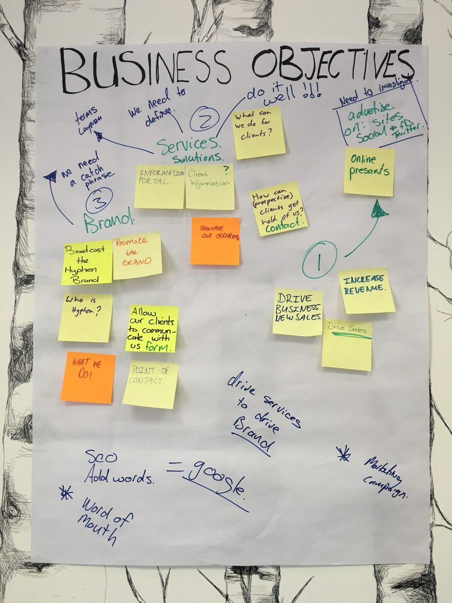
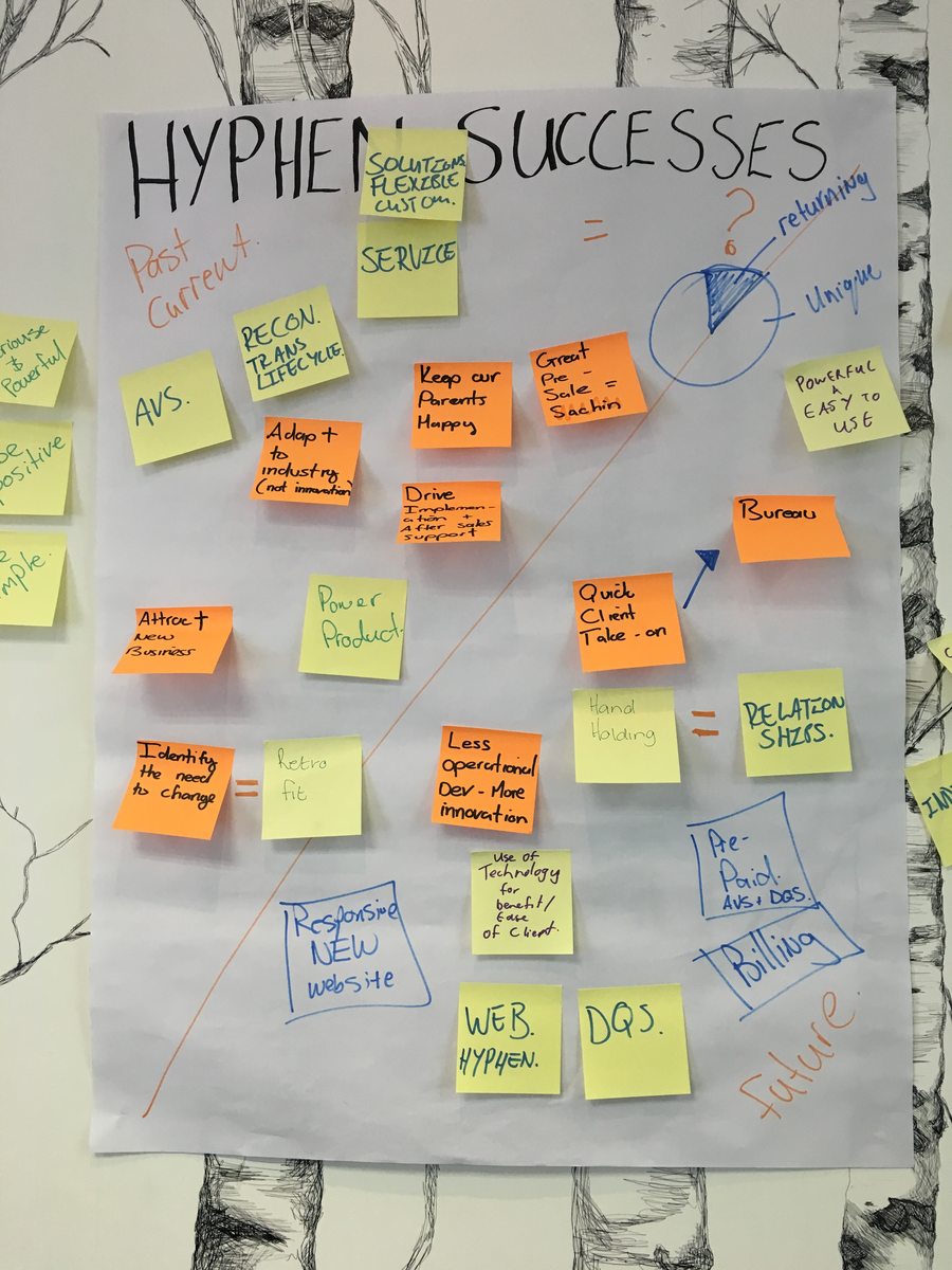
Hyphen asked for a redesign. Its own requirements workshops, though, had already named the real goal: “quick client take-on”, meaning a new customer productive with the least possible training. Staff using the existing system called it “archaic” and “cumbersome”, and forgotten passwords went through the call centre. Changing how the screens looked would not address that. The problem was not one dated screen but the lack of anything shared between the products, so nothing learned in one carried to the next and every new module added to the training load.
Our approach & thinking
The work opened up once we treated it as one platform to define rather than four products to restyle. If a clerk learns once how a Hyphen screen behaves, including how you search, where the status sits and how an error tells you what to do, any module built on that frame is close to learnable before its own design starts. We ran Hyphen's requirements as workshops with their own people, then designed a single interface framework and handed it over with the patterns and the reasoning to extend it.
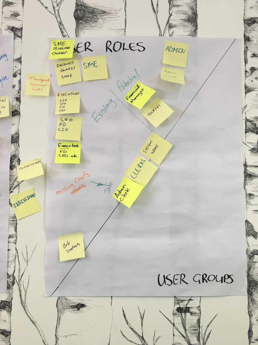
Alongside the workshops, we ran one-on-one interviews with the clerks, admins and managers who use the products daily, to see how each role actually worked rather than how the org chart said it should. That research fed into system flows, user journeys and a role and access level definition setting out what each type of user could see and do inside the platform. High-fidelity wireframes and prototypes let Hyphen's team review and sign off real screens before production work began, and we went back to the same users for one-on-one usability testing as the design matured.
One frame for every product: a consistent structure that every current and future service is built into.
Navigation built around operator tasks: Workspace, Transactions, Reconciliation, Authority. Services a client has not bought are dimmed rather than removed.
Time and system health kept on screen: a cut-off clock counting down bank deadlines, and alerts for a bank outage that cannot be dismissed until they are resolved.
Errors and exceptions treated as part of the interface: plain-language validation at the field, and exception counts shown in the batch list itself.
What we shipped
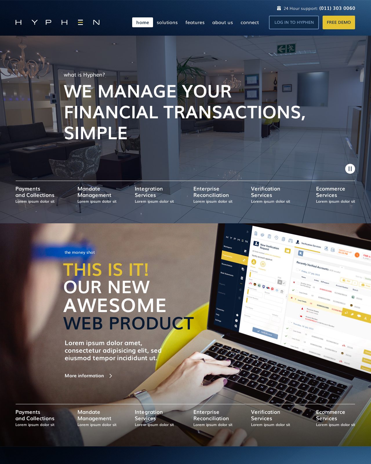
A single Hyphen portal framework, with the AVS and DQS verification services, the Transactions module and Mandate Management rebuilt into it, a sign-in and password-recovery flow that no longer needs the call centre, and a documented style guide and interaction guide the internal team owns. The public Hyphen site was rebuilt on the same principles. Across all of it, the platform holds the operator's context, such as the clock, the alerts, the exception counts and the field errors, rather than expecting them to keep it in their head.
Every module went through cross-browser testing, UI and UX testing, and UAT with Hyphen's own team before it shipped.
Outcome & value
The framework and its style guide became the standard way new Hyphen modules are built, and the design system stayed in use by Hyphen's own team well beyond the original engagement. Each new module arrived consistent with the last. Sign-in and password recovery moved off the call centre.
For the clerks and managers who use Hyphen every day, the platform stopped being four things to learn and became one. For Hyphen, quick client take-on became a realistic goal, because a shared frame means every new module and every new customer reduces the training and support cost rather than adding to it. If the work had stopped at a visual refresh, the fragmentation would have stayed, and the plan to bring on clients faster would have remained limited by how long it took someone to become competent on the system.
In summary

Next steps
Recognise something of your own product here?
Let's talk about it.
Tell us what you're working on, what you're trying to achieve, what isn't working, or where you think there's an opportunity.